Search This Blog

Showing posts with label studio;. Show all posts

Sunday, April 30, 2023

Grey Heron - Adapting to One's Environment

Adapting to One's Environment, 12x16, available

The photo I took for this painting was taken while visiting my son in Kanazawa Japan. He had moved there to teach English a few years after graduating college. This would be around 2006. The city sits between two rivers, so I am not sure which river this is along, but as you can see, it is concrete and granite banking the river. Kanazawa sits along the Sea of Japan on the western coast of Japan. I took the photo from across the river, so the actual image is quite grainy. I had to fill in some areas that did not read well, especially around the eyes.
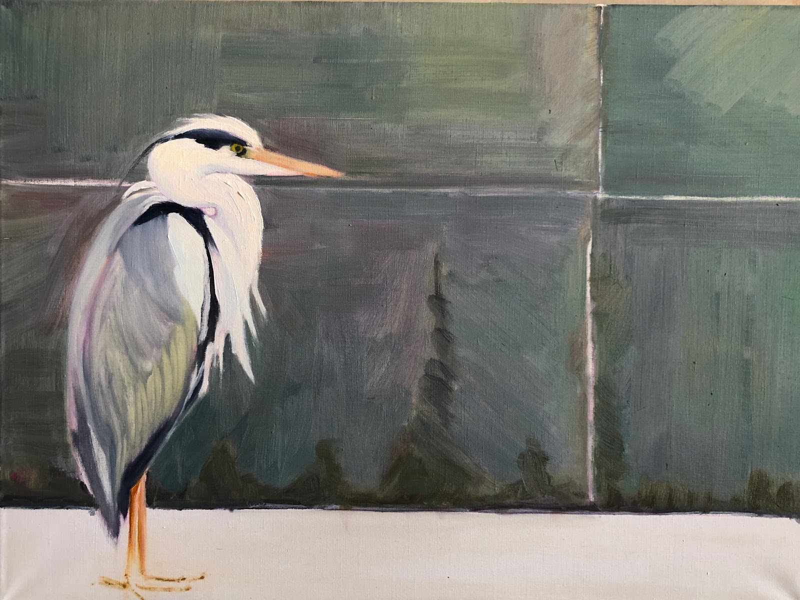
1. Getting the Shapes in

I sketched the bird in with a crimson colored pencil, which you can see still in this block in as I figure out relationships in shapes and values. My thought was to have the Heron blend into his 'environment,' so I used the same color palette for the granite wall and the bird.

2. Darkening down the wall

Even thought I liked the colors in the granite wall, I decided it needed to be more neutral so I added a darker value of a greyed blue overall. Dry-brushing it on to allow texture. I added a pinkish color to the concrete surface which as up to this point, I had left blank canvas. 
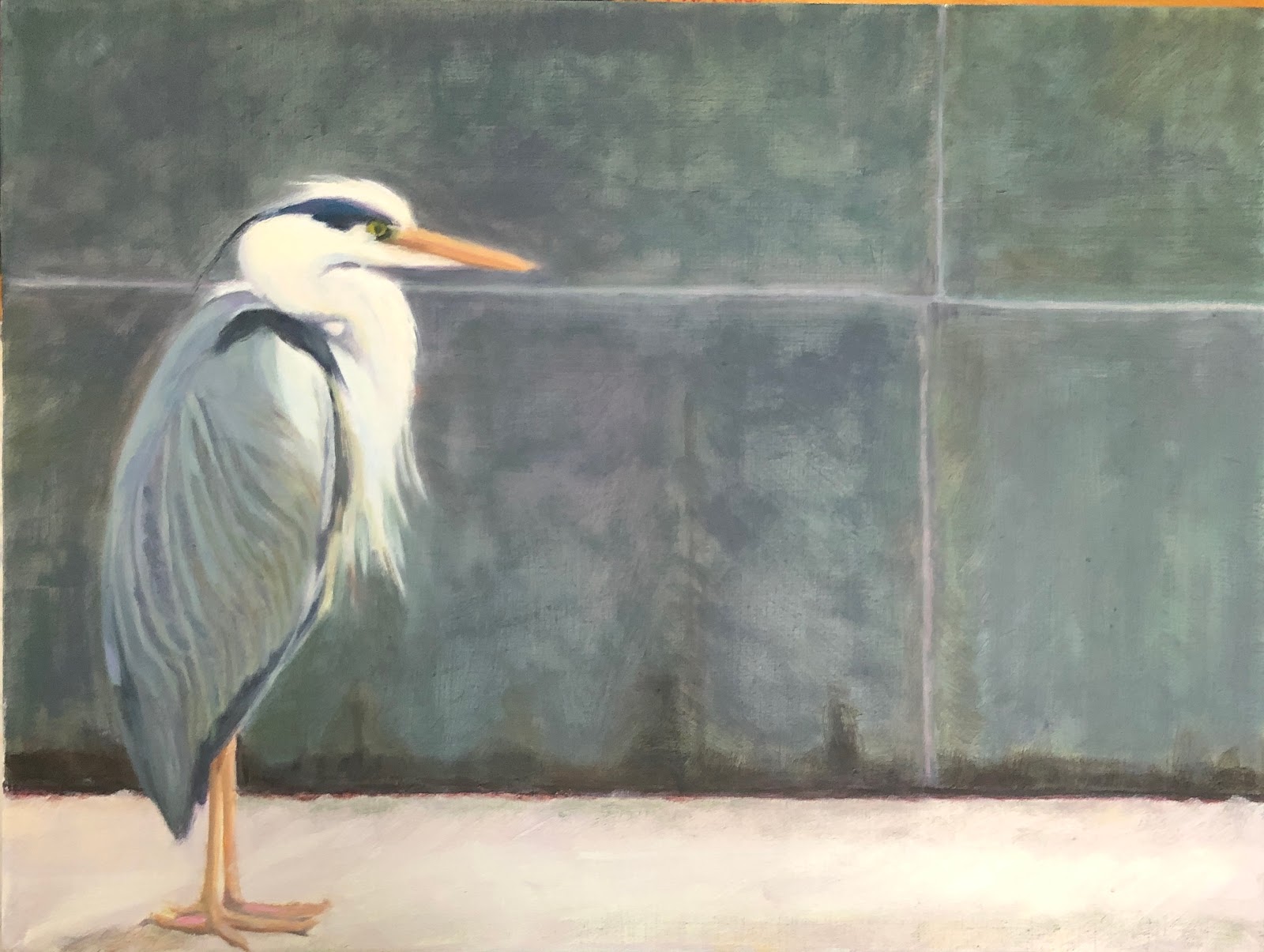
3. Finishing the bird
Now that the surrounding area is where I want it, I start work on finishing the bird. I softened the hard dark blacks and darkened the greys of his feathers. Also added some soft yellows and purples to his neck and head.

All these images were taken in my studio with my iPhone. I find it interesting that the earlier photos look darker than the last. 

Friday, February 14, 2020

I am Back! With another pet portrait

Jeez Louise. I knew it had been awhile since I have written a blog post but would never have guessed it has been 2 months! Yes, the holidays were in there but here it is Valentine's Day! It isn't because I have been slacking off. Well, possibly a little. I have had house guests as well.

But here I am with a commissioned painting that was finished up in the past week. It is not a normal pet portrait as it has a human in it which takes it out of the 'pet portrait' category, yet I don't want a new category as I don't want to be a portrait artist. This was commissioned by a friend as a gift to her sister for all the help and support she has provided during my friend's very long and trying divorce.

Her sister just lost her beloved dog and since she is mostly in shadow and a very simplified shape I decided to do this painting for her.
Hollie and Jill, 12x12, oil on linen panel
My main goal was to capture the contentedness of the dog, Hollie. I believe I have caught that. My instructions were to focus on the dog, it supposedly to be a dog portrait. I ended up putting more into Jill than was expected just because I wanted to show the love from her to her dog. My friend is thrilled with the painting. I am gratified to have another happy client especially since she is a friend.

I will start playing catch up and posting more regularly again. Thanks for your patience.

Sunday, November 3, 2019

Stormy III or Stormy Napping - cat portrait


Stormy Napping, 9x12, oil
The comment I received from Stormy's owner when I sent him an image for final approval of #3 was:

Purrrrfect!!! She looks so "Stormy" like! That's our kitten who just had her 13th birthday You do such lovely work Victoria!

Can't get much better than that. It is nice to have satisfied customers. I stopped doing pet portraits years ago after one client had so many little tweaks. She was finally satisfied but I was done with that.

To keep with the other two portraits (https://victoriasart.blogspot.com/2019/10/stormy-ii-cat-portrait.html and https://victoriasart.blogspot.com/2019/10/pet-portrait-1-stormy-outside.html) I found an old 9x12 plein air painting from 2008 to paint over. It was a path leading into a dark grove of trees with some tall grasses catching the light. I turned it upside down to start this painting. I drew in white chalk a basic outline. I decided to paint in the background to get rid of distractions and start my building blocks. I liked the strong texture coming through from the path of the painting underneath for the background. Interestingly enough, the wall in the photo was an old textured plaster wall. I recognized it as I have the same in my house.
Blockin start
Next, I started with the bigger shapes of the cat and outlined the blanket folds. I did like the green coming through, as I own a green plaid blanket and it seemed apropos with it already laid in so nicely!
Alas, it was not a green plaid blanket Stormy slept on. Never having to paint plaid before I think that intimidated me more than anything else. So, go to the trusty shape thing and don't worry about what it actually is. The owner doesn't seem to mind that it isn't a perfect rendition of the blanket but is of Stormy. A man who has his priorities straight!

I did have fun doing these pet portraits. I like doing cats, I have decided. A shout out of thanks to The Whole Cat & Dogs too for the referral. They have been amazing in promoting me to their customers. Stop by and see them when you are on Old South Pearl Street

Thursday, April 4, 2019

Tom Cat revisted


Tom Cat, 2019, 20x20, oil on canvas
Here is an update of a painting from last summer. I was never really satisfied with it yet I could not figure out why. Everyone who saw it remarked how they liked it. Finally, I figured out what was bugging me.  So that you can see the difference, I will post the painting from last summer.
Feral Cat, 2018
I liked the colors in the walls but somehow I felt it still wasn't quite right. Almost felt dirty rather than in shade. The other big thing for me was the cat's face. I don't know why it was so hard for me to get that right.

Going back to it I saw a number of things right off the bat that had escaped me previously. First thing I noticed was the cat's back. The cat was a bit to thin on top which was one of the reasons the face didn't look right to me. That was easy. Then the ears. The ear on the left was too small and the space between the ears was too broad. That was easy to fix too. Next I realized I was a bit off on the nose so got that done.  This is on an island. I felt that even though it is 'said' cool light, warm shadows; warm light, cool shadows, there would be a lot of reflected light and and I wanted the warmth to come through of the ambient air. So I changed the overall color of the whitish walls in shadow. As so happens whenever you redo a painting you have to sometimes lose something you are attached to to make it work better overall. So I kept some of the rosiness of the front wall coming through but not as much as there was. I also decided to add the clouds. I think they help make it more interesting. And a few more holes in the plant to give it more dimension.

Your comments are always welcome. If you have a more creative name than Tom Cat, let me know!

Friday, September 28, 2018

New Years Day-Roxborough

New Year's Day- Roxborough State Park, 16x20, oil on panel
So Here We Go Again. I had just decided to not do anymore 'before and afters' on my blog. Afterall, I consider myself a 'professional.' Professional artists don't make mistakes of such an egregious nature. Of do they? I know this artist does.
2 or 3 years ago version
But then last night I had a call from a dear friend of mine. She is also an artist and I value her input and her eye. As we were talking she mentioned how helpful she found my 'before and after' posts. That they contain valuable information. Jeez Louise. Now what? I laughingly told her how I had just vowed to do no more of those as I spent the last week or so excitedly redoing paintings I found to be flawed in one way or another. Some of them I wasn't even sure what it was that bothered me but I just knew they were  not for public consumption. I was telling how much fun it was to all of a sudden 'see' with such clarity what was wrong in a number of these 'face to the wall' paintings.

Here is one such failure. The bottom one was done from a photograph (yes, you read that correctly. A 3.4 x 5' photograph to be precise). This scene is from before digital cameras if you can even remember back that far. I came across it as I was culling my old morgue file. Before throwing this photograph away I decided to paint it. From a photograph. Like I used to. How we did that is so hard to fathom these days.

Let me start with the fact that the shadows are not united in form. Add to that the fact that the grasses are so bright against the purple and are not reading as they should; that some of those plants are in fact, in the shadows. If I remember correctly, I was in a hurry when I painted the original. Looking back I do see that the photograph is brighter like the original version is. So at least I got that right. That dark bullseye purple shadow in the middle did nothing but detract from the whole, drawing your eye right to it. How did I miss that?

In the new version my first step was to change the sky color. I darkened it down a wee bit in value and put some violet in it. Then on to unite that shadow shape and tone down the purple, adding value and temperature shifts within the shadow. Adding a variety of plants-they are not all grasses! In the plants I added greens and cooler yellows and some deep reds as well as keeping some of the oranges and warmer yellows. I remember that originally I wanted the deer to blend in to the scenery and now on this version I want them to stand out. Even though it is not overall as bright and sunny as the original, I believe the new toned down version reads better overall. And if I did not show the original you would not know the difference. It is always a crap shoot redoing a painting. Always someone who prefers the old vs the new. But though I may still decide to brighten it up and add more warmth to it I am much happier with it now.

Tuesday, January 24, 2017

The Rush is On

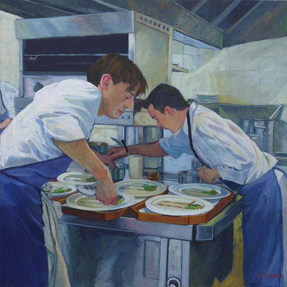
Starting with the finished piece first and then the explanation for a change. I repainted this piece over three or four days while also working on a few other paintings. It took me a bit longer than I expected as I thought I would only "fix" a few areas. I don't think I left anything untouched except the hair on both of their heads.
2017 The Rush is On, oil on canvas 24x24


2010, oil on canvas, 24x24

2016 showing repair and mounted on board (bad lighting lightened up the overall image)
This painting is 6 years old. There is nothing major wrong with it for where I was at 6 years ago. A year or two ago I had hung it in a place where I could look at it with the thought to revisit it. If a painting hasn't sold, it is always fair game. For whatever reason, it fell off the wall one night - it woke me up- and on it's way down, hit a few places and in one particular sensitive area ripped a substantial hole. I could not decide if it was worth fixing or if I should just chuck it. I researched repairing paintings. So many different approaches. Some said do not patch an area as it will shrink at different rates and then will always looked patched, so reline the whole painting. Others said patch and you will be fine! The repair kits I found were nowhere near a 24x24" size. This particular painting was cotton canvas on the 1.5" profile of stretcher bars. Not my favorite painting surface.

After much contemplation, I took it off the stretcher bars and glued it to a gator board trying very hard to line up the edges of the tear across the front waiters forearm. I filled in the area with a bit of gesso and lightly sanded the area. I could not sand it smooth as the texture of this canvas was rough. I tried refilling the area and sanding again. All I can say is that it is as good as I can get it. It was worth trying to save at this point as moving forward I was going to repaint the whole thing. The structure and drawing are pretty good so it should be pretty straight forward. The major issue with the original version from my perspective today is once again a value thing. So in the redo, I pushed the values away from the middle. Not much color shift overall except in the skin tones. I thought the waiter in the back had too blue gray a skin tone so I lightened up his face overall and to his arm in the shadow made it a reddish blue.

There is something about the original version that I still like but overall I am still happier with the redo.