Search This Blog

Showing posts with label Landscape studio; work in progess. Show all posts

Friday, October 31, 2014

Trail Down Herman's Gulch

Block in, 18x24, oil on oil paper
Here is a studio landscape that I was determined to try and maintain a more loose or painterly approach throughout. So far so good on the block in. Keeping the big shapes very simple.
Next phase
I tightened up on the background area but still keeping loose up front. I can live with that since I want the distant hills to recede and quiet down. I added more blue to the back hills but they are still retaining too much color variation and not enough depth. The trees had light added to them but still must remain darker than the hills behind them. Played with the path a bit to give it some depth.
Trail Down from Herman's Gulch, 18x24, oil on paper
Here I blued down the distant hills again...it is amazing how much blue you have to use to get them to recede! I added the clouds, still keeping the strokes loose, added some flowers to the hillside and more motion to the path calling it done. Sure love this hike and have always wanted to paint it. There is a view from up top that is still on my radar to paint.

Friday, November 29, 2013

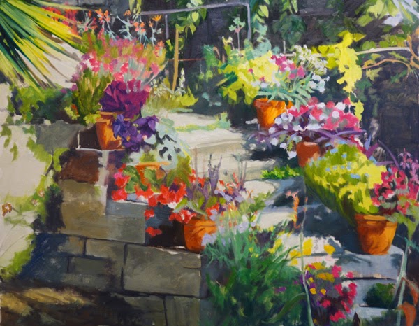
Staircase to the serre des cactées au Jardin des Plantes (Paris)

Floral Staircase Block in, 24x30, oil on board
We are still in Paris for this next exercise. This painting has the visual approach of "equalization" which is being used as an element here. ie, each potted plant has a pattern within it that is relatively equal in size and shape. This top photo seems a bit garish, especially compared to the bottom one but I was using bright colors to block in. The truth is somewhere between the top painting and its exaggerated (but not overly) color and the more washed out look of the second photo. 
Day 2
That being said, I really am finding out just how tedious "equalization" can be. I am attempting to not get too caught up in details, but even so, Lots of small flowers are involved here! In the block in I was attempting to get larger blocks of color as placement and flow, and the overall dark light/pattern of the sunlight and shadows.
The next day I started paying more attention to the actual patterns in each potted plant. I want them to be distinguished one from the other . One of my pet peeves as a gardener is to see paintings of flowers where you really cannot tell what they are. I don't need it to be perfect, but plants have their own personality and structure. I do want people who know flowers to at least have an idea of what the plants are, not just that they are plants.  The next post will show more fine tuning. It is good for me to document progress as a photo shows me things that I may not have noticed until I photograph it. Just as an example, the top "step" looks canted as the little step is not defined enough by the strip of nondescript greenery. I have since fixed that but it had not jumped out at me prior to taking the photo. Stay tuned for the next step in the process.

Wednesday, May 9, 2012

Easter Sunday on Half Moon Bay

Easter Sunday Beach Walk, 6x6
I took this photo while we were in Half Moon Bay, CA visiting our niece this past Easter. It was a cool and breezy day, but there was still plenty of activity on the beach. I have switched to this smaller format for the time being as I felt I was getting bogged down in my larger paintings lately. I needed to have some sense of accomplishment and the smaller format, while it has its own challenges, allows more room for that. I got 5 done last weekend, this is one of the better ones. It is simple in its composition and color structure, which is suitable for the smaller format. I do see a few tiny fixes that need to be addressed now that I have looked at it for a week. The footprints in the sand in the middle left hand side distract from the over all viewing experience due to the fact that they are all similar in size and shape. They need some variety and to recede. ie they are too static.

I have discovered an auction site online for artists; similar to eBay but strictly art. I would like to give it a try but want to start with small paintings. With that in mind I had my husband cut a stack of 6x6 boards. This is my second attempt to paint in this format, as I started last fall with the intention of submitting to a show in California that is devoted to 6x6 inch format. I did not submit to that show, so I have those paintings ready too. I am using just birch boards as the surface so again, it forces me to lay thick strokes down. Once I get my account set up and running I will post the link here with a view of the corrected painting. See you then!

Friday, March 23, 2012

Cattle Crossing

Cattle Crossing Work in Progress, 12x24, oil on board
Last weekend I started two paintings simultaneously. Neither of them was I able to complete. This one is along the same vein as the painting I posted last week of the cattle in the field. These are both from the same trip to Wyoming, but this one is on the way to Sarasota Springs, so north of Walden, CO. I think the block-in went pretty well, although don't look too closely at the cattle's feet. Talk about a puzzle to work through. I want to keep them as a teeming mass so don't plan on pulling out too much detail. I want the focus to be the main cowboy and his dog.There is another cattle dog that will be at the tail end (literally) of the second cowboy. This has been a nice change from alleys.

Thursday, March 15, 2012

Wet Paint

Untitled, 12x24 on board
In an effort to feel like I am accomplishing something I switched to a smaller size and to force myself into having to apply more paint, I chose a plain birch board. Since an unprimed board absorbs the oil in the paint, it means I must paint thickly, which is not my preferred method. I opted for this simple scene that I shot a few years ago on the road between Laramie and Cheyenne. It went quickly despite the fact that I had to apply one dab of paint at a time and I could not scrub my brush to cover large areas. Gives a good  impression of a hot late summer afternoon me thinks.
This painting is in need of a name if anyone is so inclined.

Saturday, February 18, 2012

Sunrise Rising Up

yet to be titled Sunrise over Iowa St, 36x36, oil on canvas

After weeks of being unable to work on this painting due to a shoulder injury and then on top of it not being able to keep up with my blog due to my laptop being infected with nasty virus's, we are back in business. My shoulder still cannot take a full day of painting but it seems to be getting better slowly with time. My laptop, after 3 visits to the shop, I pray, is finally clean. One thing I can say though, I am getting used to not feeling drawn to be on the computer since it wasn't available, and I have grown to like it!

I had posted this painting in progress a few weeks ago when it was first started and then I began another, smaller piece in between. That waiting time was good for this painting because when I got back to it, I was ready and it just flowed. The movement and orchestration of the medium value of the trees is critical to the light. This piece is still a work in progress but great headway was made and I wanted to share it. I don't know if I will get to finishing it up this weekend and did not want to wait any longer to post the progress. Where it still needs to go is neither the signs marching up the street to the stop signs, nor the tree structures within the right-hand side mix of leaves and branches, have been completed, along with a few other minor details.

I took this painting in to work this week to see it in another light and it is the best received piece I have brought in to date. Uplifting to all who viewed it. What more could an artist ask? Art should uplift the soul of the viewer. Now to come up with an appropriate title.

Friday, November 18, 2011

Prairie Glow

Prairie Glow, 18x36, oil on canvas
This scene is NE, outside of Sterling, CO. I had originally seen it in 2005 and have wanted to paint it ever since but lacked sufficient references. This past August found me invited back to my bosses home for BBQ. Yes, my boss lives 2 hours drive from where we work. These barns and outbuildings are on the neighboring property belonging to his in-laws. I loved the light raking across the prairie and onto these buildings as the sun was setting. I do like the big sky you get on the prairie.

Wednesday, October 12, 2011

Prairie Glow Work in Progress

Prairie Glow, 18x36, oil in progress
I first saw this scene 6 years ago and it has haunted me every since. This past August found me back there once again. This is the view of my boss's in-laws property from his property on the prairie lands of NE Colorado. The setting sun lit everything with this pinkish orange-y glow which I have thus far only intimated at. I got to this point a few weeks ago and have not been inspired to finish it off quite yet. There will be a beautiful highlight of light separating the purple cloud from the blue sky; I have a fence to build and a few more horses grazing in the shadows of the hillside (I am still debating whether they are needed or not-the fence may be all that is needed). Then I want to add the rosy light in a more unified pattern throughout.

Monday, October 10, 2011

Reflected Alley Work in Progress

Reflected Alley, 36x24, oil painting in progress
"The real jolt comes...because the viewer becomes lost in the sheer beauty of it. The painting gives a person an experience of the eternal." I read this last night in a novel I am reading and it so captured how I think about my work. To capture the eternal...Wow!

I worked on this painting this weekend. Made progress and it is heading in the right direction. I have not yet been  able to jump back into painting with gusto, but the passion is still there when I do stand at my easel. The building blocks are coming together (ie the big shapes are all there now and I am starting to work on breaking them down into smaller shapes which will then reveal themselves as "details.") I like the freshness showing already in this painting of how it looks after a spring rain when the sun comes out. Glorious!

Wednesday, July 20, 2011

Winter Composition

Winter Composition, 24x24, oil on canvas


Winter Composition, 2007, oil on canvas
This painting was meant to be stylized, but the longer I looked at it the longer I did not like the tops of the winter trees or the blue green sky. The sky did not go well with the more violet blue frozen water. This painting got a lighter, more violet blue sky and simplified tree tops. The barn roof was also lightened a tad and the barn made more red, yet still keeping it in the shadow. A few of the bushes and some of the dried vegetation got a tiny bit of attention. The main difference in color between the two is different cameras as I did not touch the snow, the frozen water, tree trunks or anything in the background.

Sunday, June 5, 2011

study for new painting

Study for larger painting yet to be named, 12x9, oil on linen

Saturday I did this 12x9" study in order to work out some ideas before going to the larger 15x30" canvas. This reference was taken this past October while hanging out in the rain on Ocean Beach, SF, CA. We weren't the only ones crazy enough to be out in the rain. The red of his jacket with the reflection in the wet sand was just too good to pass up.
I had seen this red jacket coming towards me and so took a few photos. He then stopped to ask me what I was doing. Was I really photographing him? We chatted for a few minutes and I detected a French accent. He was fine with me wanting to capture the red in all that mist, but when he went on his way is when I got the photo I wanted.
My ideas are to work on gradation going from darker sand in the foreground to lighter near the sand bars on the right. Gradation of color as well. The sand goes from a blue-violet-y to a more yellowish. The challenge will be to make all that wet sand and sky (I cropped much of the sky out for this format) interesting with the color, values, and brushwork keeping it all fresh and wet looking. I can see in this photo that the sky either has to go lighter or the lighter sand has to go darker. They are too close in value right now.

Tuesday, May 24, 2011

Washington Park Researchers

Untitled, 16"x12", oil on linen
 Here is another painting where my goal was to keep my values close to create a mood. My faithful dog and I came across this very rare scene on Grassmere lake in Washington Park. There are 2 lakes in Washington Park; the north lake, Smith Lake, once again allows boats, but the south lake, Grassmere, doesn't. I figured they were doing research of some kind. The yellow slicker was just such a wonderful beacon in the fog that I thought this would not only be a good exercise for me but would be interesting too. I have walked this park steady for over 20 years and I am intent on discovering something new whenever I go there. To try and see the park through new eyes as if it were the first time I have been there. It is working! This is the 3 painting in a row I have done now around the park. I can't tell you how many times I have gone there to paint and not found anything that drew me in - it all feeling too familiar to be of interest.

Tuesday, May 17, 2011

Number 10? in the Alley Series

Late Spring in the Alley, 24x36, oil on canvas
Another alley has neared completion. Without taking an actual "head" count, I think this is #10. I have been waiting to post this painting until it was close to where I wanted it to be. I don't know that anything is "missing" but I have learned that any time I think a painting is done, I am majorly off base once I sit on it awhile. This piece has been sitting longer than most, and I did pick it up this weekend and do a few fiddly things with it.

Even though this scene is bright, it was an overcast morning where there was a diffuse light with no real cast shadows. This is called "local" tone in the vernacular. The reason being is that the "local" color of an object is not corrupted by light and shadow. Once you add a direct light source the real color of a thing is altered; So when you paint a local tone painting, the colors are more true and can have a saturated feel to them, especially if  wet as in after a rain.

What drew me to this scene initially was the catywampus-ness of the recycle bins mixed in with the dumpsters leading you down the alley to the blue Forester in the background. It just had a good flow to it. And then to compliment that was the yellow barn house and other yellowish houses and garage. I love the colors in this scene. The greens tie it all up in a nice way. Like it envelopes the alley with a feeling of freshness.

Friday, May 13, 2011

Evening Glow

Evening Glow, 20x10, oil on gallery wrap canvas
One evening last month while walking in a neighborhood park I was fortunate enough to see this amazing sky. The weaving of the branches made such an interesting pattern and silhouette against it. As I was taking this photo, two young boys walked into the scene to complete it. I just love that splash of red.

Friday, March 18, 2011

Winter Scene -

Country Lane in Winter- Bavaria, 32x20
The last post of the boats in the fog,  left me wanting to try another painting using values close together and do a better job of softening my edges. The reference photo for this painting came from our Christmas in Bavaria a number of years ago. It was bitter cold. This is a work in progress, but I wanted to post it so I can see where it needs to go from here. Painting snow is a challenge, especially when there isn't a whole lot else to break it up.