Search This Blog

Showing posts with label Before and After. Show all posts

Sunday, May 14, 2023

Lilacs

Day 3 -mostly done-thinking the 'vase' is too prominent

Wednesday of last week (May 10, 2023) everyone on our morning walk was talking 'hail!' So, I came home, covered my vegetable garden plants (we here in Denver know not to plant before Mother's Day-but who listens?), cut some lilacs, iris and hellebores, 'just in case' to bring inside. If nothing else I could enjoy the heavenly scent of the lilacs, or possibly even do some sketching of the flowers on the grey day that ensued. It did rain for 24 hours straight, but thankfully, no hail here. The area where I live has been called  "hail alley."

Sketch of Lilacs

Friday, so two days into the cut flowers shortened life, I decided to paint one of the vases full of lilacs. Being still overcast outside the arrangement was under artificial overhead light. I went and found an unclean previously painted panel, 24"x12" and proceeded. Sometimes, the first run on a used panel is the toughest, especially if the painting was varnished, as this one had been. I could not find a photograph of the painting so I am surprised it was varnished. Despite the effort put in by me, who knows how long ago, to remove the varnish and then sand it, it still lingers. The first flush of new paint means it is absorbed by the old varnish so I must remember to go darker and lighter in value to combat this phenomenon. It doesn't seem to matter - it all ends up monotone.

From Nicotiana to Lilacs- starting the block in- carving out shapes

Day 1-Black almost covered - allowing this layer to dry a bit
Saturday is not so gray and the sun actually shines forth from time to time. But in keeping with what I had started, I turned on the overhead lights. My thought was even if I don't finish the study, it has been fun painting from life and fighting the substrate at the same time. Today's effort felt less like a wrestling match and more fluid and easy. 
Day 2- Big shapes defined

Day 2 before quitting for the day- Lilacs holding up so far 

Day 3 Sunday is just to finish the vase. Which is really for drinking wine, I believe. I inherited it from my parents and is from the 60's when we first moved to Germany. I am not sure what it says on it but I believe it has to do with cultivation of wine.  It does have a handle but I have ever only used it for a vase.

Tuesday, March 14, 2023

Before and After, Debbie's Place

Debbie's Place, Hopland CA, oil, 11x14

This painting was started as a plein air painting in 2007. Debbie was a neighbor of my in-laws up the road in rural Hopland CA. I regularly brought my plein air gear when visiting and did many paintings over the years of this area. Debbie raised these sheep for their wool which she sold to weavers all over the country. I have sold many paintings of her sheep! This was one of my more adventurous paintings from that time period. My vantage point is looking down the hill from behind the fence, standing on the side of the dirt road that is basically one lane. Traffic was not usually a problem.

I recently reworked it yet again as I can't seem to get it where I want it. I think it is as good as it is going to get. When I can't get motivated to paint on the current round of canvas's I have going, revisiting an unsold painting is an easy way to get me interested. Nothing is ever finished around here until it goes out the door! There is a wedding in the family coming up and I was wondering if I should do a new painting for the happy couple or one that the bride would relate to from her childhood. That was the motivation on picking this particular piece to revisit. Some of the photos below are darker than the painting would have been due to the changing digital photo technology but they are not tampered with.

Original, plein air, 2007

First Revision, 2008, looks like a yellow filter! but not
It looks like I corrected some of the drawing on the sheep's shed and took out the blues and dark greens from the grassy hill. I wonder if that was shadows from the trees originally as the roadway was bordered by trees? It is too long ago now for me to know what is was that I was doing as the photo I took has the hillside in sun.
Second Revision, 2011

I have not included the 3rd or was it the 4th revision as it is very similar to the second except I added the dark sheep in the middle ground in the middle. The original plein air is not as bad as I expected it to be, but then, I have a history of not liking what I do on site and can't keep my hands off of it. Either I wipe it off then and there or I keep finding fault in it. I have gotten better about these high expectations over the years, but I don't paint outdoors as much and I have learned the hard way that they are not normally as bad as I think they are if I let them sit for awhile. Those painting that do end up being as bad as I thought, I have been painting over, which I enjoy doing.


Friday, November 18, 2022

True Confessions

I started this post two months ago-then promptly forgot about it.

Many of you may not remember the publication from back in the day and truthfully, I don't know much about it. The title sure stuck in my brain, however. It is a humbling experience to review ones work and find some of it, surprising in its lack of what one knows as a foundational principle.

This is one that first struck me as decidedly 'off' and yet at the time of its execution I thought I had done such a good representation. Which I had done. The thing was, I ignored what I knew and copied the image with its distortions as if it were true to life. One thing I had forgotten, or neglected to observe, and it is a big thing, is how the phone camera distorts perspective. What's wrong with this picture?


It is that all of the vertical lines should be parallel and straight up and down. The difference in color is from the devices used. The remake is with my iPhone. I think the image above was with my digital camera. A stark contrast...surprising or not, the iPhone image is more true to the painting. It did not take much to straighten the window edges out.


View from Above, 9x12, oil
There will be more revised paintings coming as I pulled a number of them out to revisit. I am so out of the habit of writing and posting that I am way behind. Thankfully, there weren't very many with the perspective lines out of whack. 

This painting is from my last trip to Italy. It reminded me of myself as a child living in France. Our house had three stories and I often sat in the window overlooking a street through our city that was a thoroughfare. I ticked off on the windowsill how many cars with British plates on their way to or from Paris.

Thursday, August 11, 2022

The Good, the Bad and the Ugly

After: Waiting on new window-back to original size. plastic for now

This week's painting is interior. I had my main floor bathroom remodeled during the month of July -I live in a house built in 1890 or thereabouts, so no ensuite bathrooms in this ole gal-and to save $1000 I took on the painting of said bathroom with assistance from my daughter and son-in-law. Then, since the basement is not finished according to modern standards, there was quite a bit of dirt, dust and other detritus that fell through the old floorboards during the tear down and rebuild onto the basement floor. Since the floor and surrounding area had to be cleaned anyway, it seemed a good time to paint the old wall and floor, at least in that section. I am not a glutton for punishment, after all! Between that, having a friend come for a long weekend along with the two of us driving back and forth to a Kaiserslautern High School reunion, it has been a busy time. Then the bathtub refinish was the last item and happened Monday. That was less than stellar so now the same kid is coming back today to try and buff out the many imperfections in the new finish. When he masked off the bathroom - all sparkling new - his tape ripped off the paint in several areas so I need to go back and touch that up once he is gone today. Not sure if he will tape it off again, so I am not willing to do it any more than necessary. 

Before: ceiling above shower raised back to be level with the rest of the room; toilet, medicine cabinet, light and sink replaced.

Here is the painted floor in the basement-nothing glamorous but looks fresh :


Tuesday, August 2, 2022

Remake - Sausalito Houseboat

Original with a few adjustments already begun

Almost finished, but not quite, 20x16

This is a remake of an old one I did when in class over 10 years ago. It is quite ugly and every time I came across it I wondered why I didn’t just throw it away. It is of a houseboat in Sausalito CA. Richard and I had stopped there on our way back from San Fransisco to his parents house. It isn’t a pretty boat to begin with, but I sure didn’t improve it any! I could not find where I had ever taken a photo of it that is how much I disliked this painting.

So as you can see, the top one is the ‘original’ from class, when we were studying textures. Which I did very well as far as that goes. But it was so dark. I had already decided to take out the wooden structure on the left and you can see my corrected drawing, in pink, as to the top of the boat so there would be more sky and better proportions. The siding should be white but it looked so gray and dingy. So will it ever be a great painting? No. But it gives me a feeling of satisfaction to fix something like this. I still have to finish the big window and put the bike back in a few more finishing touches, but you can see the difference, which is all I wanted for today. Side note: I wrote this almost two weeks ago and then was distracted by a bathroom remodel so never posted. Here is the painting today as I did get some work done on it between painting walls and trim.


I used the side of an old credit card to get the illusion of rough wood with peeling paint. It is fun to do, although would not work for most of what I paint, it works well for this. 

Sausalito Houseboat, 16x20, oil on panel, available


Here is the 'finished' painting, at least for now. From the last photo, I dulled down the wooden screen in the window, finished the plant, redid the reflection and finished the bike. 


Monday, July 12, 2021

Basset in the Sun


The Basset in the Sun, 18x24, oil, available
 

The photo reference for this painting was taken a number of years ago. I loved the sienna tone to the whole image. As often happens with my reference photos, is I see something in them when I take them, but then once I get home, it just doesn't speak to me right away. Then when revisiting my photos at a later date, the reawakening of what drew me to take it in the first place comes back. This is an old rescued dame, who once her owner died, no one in the family wanted it. The cousin, who loves all animals, drove a few states away to go pick her up and give her a few good years with the rest of their menagerie. She seemed to have settled in just fine and found this perfect place to sit in the sun. Her name is Clio.

I enjoy doing pet portraits and though this is not a commissioned portrait, I felt compelled to honor this solid basset hound. She seems so regal in her bearing. I started with an old painting as I often do. My intent on this was to record the progress from start to finish and make it into a video. I did all the work to do this but the resulting video is not as good as I would have liked. The program seems to have made all the images darker than they were already. It hasn't been easy to photograph due to the fact I painted over a varnished painting. The glare from the varnish comes through, and painting on varnish also absorbs so much of the paint to make the new layer darker than what is applied. You would think I would learn and remove the varnish before starting a new painting, but I am lazy. So instead, I constantly fight this fact and then it is really hard to photograph on top of it. When will I ever learn??

For the longest time, I wanted to leave some of the sunflowers coming through the dog but ultimately I decided they were just a distraction.


Friday, February 21, 2020

The Old with the New


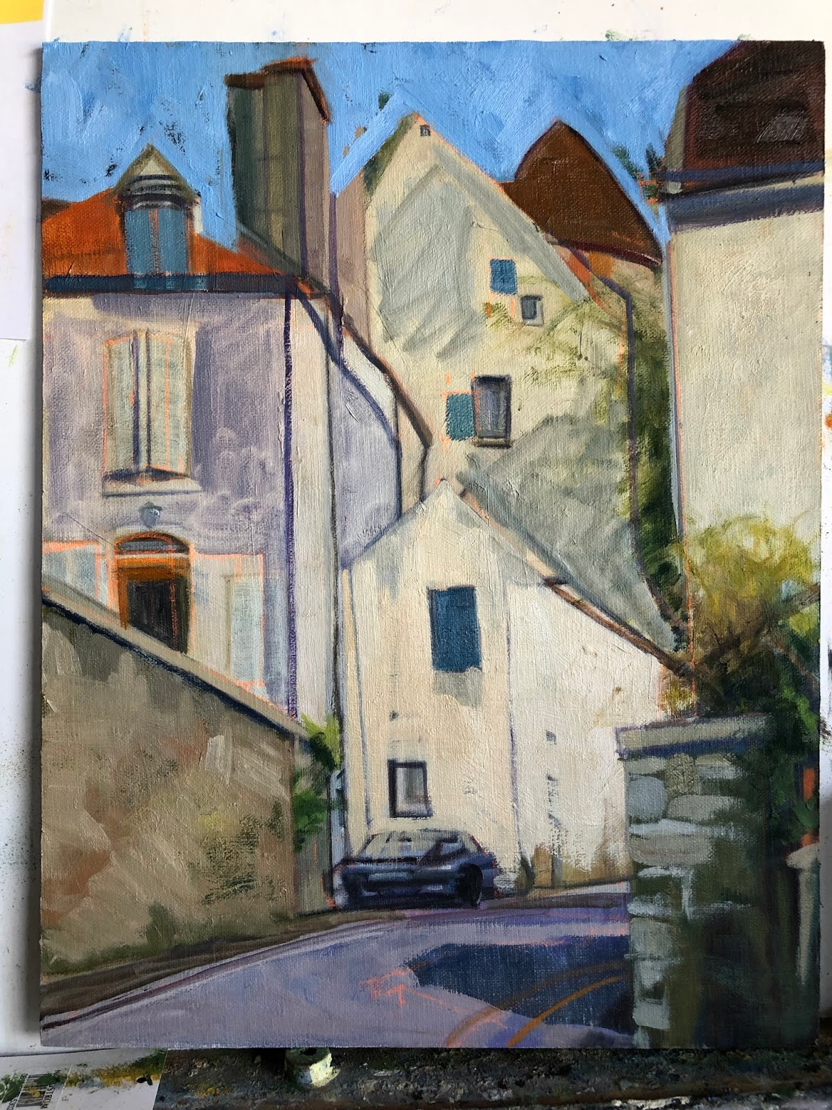
Semur Street Scene with Car, 14x11, block in
To start of this new year of 2020 I am posting an updated painting I started back in 2015. Here is the original block in from that year. Not bad at all. I did a number of paintings from that 3 week trip to France. In my quest to have better paintings overall, I picked this painting to update. Surprising to me was that I had no updated images of it since the block in phase and I had considered it 'finished' at some point in time. So I did  not think to photograph it before redrawing it and starting in again. Below is the latest restructured image. Not too many corrections overall. I wish I had looked at the original block in before starting over as I see plenty of things I like in it.


Semur is an old walled town in Burgundy, France. I found so much to like about the winding streets and old buildings. We only spent an afternoon walking around this town yet I have done at least 5-6 paintings from there. It is amazing how many centuries these houses have seen, yet still stand.

Semur Street Scene with Car, 14x11. oil 

Thursday, April 25, 2019

Paris Rains

Paris Rain, 30x20, oil on linen

Here is a painting I did about 5-6 years ago. I was so very pleased with it at the time and proudly hung it in my home. It was done in the master painting class I took with Kevin Weckbach and it was the piece I did for the month we studied Dark/light pattern. In my quest to make improvements on existing 'finished' art works, I started to study this piece. Why had it never sold? Was it the subject? Or the way it was handled? Composition seems good to me. There were a few small things that I thought could be improved upon but overall I was still pleased. BUT. Once I got started working on it so much started to pop out. Drawing being premier. Just some subtle things but which I think make a difference.

The bus at a wrong angle on the backend; a few angles here and there on the umbrella's; I added some  tiny features to the figures faces. I don't like faceless humans and though there was a hint at features in the faces, I put a bit more character into them; a bit more shape was added to the clothing: The woman's raincoat was lightened and given more form, the man in the middle now has a pocket on his jacket with his left hand now in a pocket; and the man in the red umbrella lost a little weight and has a brighter blue jacket on, which brings him out from the woman behind him. I darkened the pavement (although in the image it doesn't quite show up as the paint is still wet) and made the crosswalk a bit more distinct. My daughter's comment was "It looks so much lighter." And yet I had darkened more down than added more light. An interesting paradox.

I had pulled this painting out to update it prior to Notre Dame burning but the spire is in this painting. So weird to contemplate that it is now gone. Let us pray that when the repairs and rebuilding are done that they have enough common sense to rebuild as it was and not some horrific idea of 'improving' upon it. Our culture seems to have a huge ego and superiority complex, especially when it comes to history.
A Rainy Day in Paris, 30x20, oil on canvas, circa 2014 or 15

Wednesday, October 10, 2018

Cortona Italy


oil on linen panel, 15x30

Here is a scene from a trip to Italy I was on a few years back. It is in the Tuscan town of Cortona. One of the many walled used to be city states.  I was taken by the colors and the building block effect I saw as I came down a hill towards the main square. We were only there for a few hours, but in that time we went to a private wine tasting, the sprawling street market and explored many of the side streets away from the main tourist sections. Yes, there are still places in a small town to escape the disgorging of tourist buses. Even if that area seems to be shrinking daily. 

I have no name for this painting yet so if something comes to you, please let me know.

Friday, September 28, 2018

New Years Day-Roxborough

New Year's Day- Roxborough State Park, 16x20, oil on panel
So Here We Go Again. I had just decided to not do anymore 'before and afters' on my blog. Afterall, I consider myself a 'professional.' Professional artists don't make mistakes of such an egregious nature. Of do they? I know this artist does.
2 or 3 years ago version
But then last night I had a call from a dear friend of mine. She is also an artist and I value her input and her eye. As we were talking she mentioned how helpful she found my 'before and after' posts. That they contain valuable information. Jeez Louise. Now what? I laughingly told her how I had just vowed to do no more of those as I spent the last week or so excitedly redoing paintings I found to be flawed in one way or another. Some of them I wasn't even sure what it was that bothered me but I just knew they were  not for public consumption. I was telling how much fun it was to all of a sudden 'see' with such clarity what was wrong in a number of these 'face to the wall' paintings.

Here is one such failure. The bottom one was done from a photograph (yes, you read that correctly. A 3.4 x 5' photograph to be precise). This scene is from before digital cameras if you can even remember back that far. I came across it as I was culling my old morgue file. Before throwing this photograph away I decided to paint it. From a photograph. Like I used to. How we did that is so hard to fathom these days.

Let me start with the fact that the shadows are not united in form. Add to that the fact that the grasses are so bright against the purple and are not reading as they should; that some of those plants are in fact, in the shadows. If I remember correctly, I was in a hurry when I painted the original. Looking back I do see that the photograph is brighter like the original version is. So at least I got that right. That dark bullseye purple shadow in the middle did nothing but detract from the whole, drawing your eye right to it. How did I miss that?

In the new version my first step was to change the sky color. I darkened it down a wee bit in value and put some violet in it. Then on to unite that shadow shape and tone down the purple, adding value and temperature shifts within the shadow. Adding a variety of plants-they are not all grasses! In the plants I added greens and cooler yellows and some deep reds as well as keeping some of the oranges and warmer yellows. I remember that originally I wanted the deer to blend in to the scenery and now on this version I want them to stand out. Even though it is not overall as bright and sunny as the original, I believe the new toned down version reads better overall. And if I did not show the original you would not know the difference. It is always a crap shoot redoing a painting. Always someone who prefers the old vs the new. But though I may still decide to brighten it up and add more warmth to it I am much happier with it now.

Friday, May 11, 2018

Attachments

I figured out why I was so stuck on one of the paintings I started in January this year. It seems to always be the area one is attached to that is holding up progress and/or one's unwillingness to let go of said area. So even though I haven't finished this piece yet, I wanted to post it to show how attachments you need to let go of, hold you up.

Last Saturday I had dinner with a writer friend of mine. She was talking about a new essay she had written for her online newsletter. She was lamenting that she had to cut the best line out of her latest work to make the rest of the article pull together. How her attachment to that one line was keeping it from being a cohesive whole. But that maybe she could work that cut line in some not yet unwritten piece in the future. I then proceeded to tell her I had the exact same thing happen to me! Except in paint. Her first response was oh how sad! I could not ever reuse it. Which isn't exactly true. I feel that every time this happens there is always a takeaway from it.

This first image is where I had finally roughed in the sky really liking the energy of it. Unfortunately, I put it in after I had already begun painting atop the block-in of the rest of the painting. I remember being intimidated by the sky in the reference, so I was in avoidance mode. Leave it until I am ready or can't ignore it anymore.

When not done in proper order, confusion results
If I had added the sky when the rest of the painting was in the same state (below), who knows where it might have gone, right? My aim is always to keep some of that block-in brushwork but it is so rare, not sure why I keep thinking that will happen.

block in as I figure out shapes and proportions
Here is the painting with the new sky that better fits the rest of the piece. The new sky actually helps the piece overall so much it almost seems like a new painting and yet I feel I was able to keep some of the brushwork I had become so attached to. I can finally go back to the rest of it now that it doesn't feel like two separate paintings. I don't think it will take much to finish. To be continued.
Starting to pull together finally


Thursday, September 28, 2017

Orchids evolve

Studio Orchids II, oil on panel, 20x16
Here is an oldie but goodie. This piece originated in 2002 when I was very interested in orchids in particular, and plants in general. I liked doing what I considered 'plant portraits.' Not so much in the botanical illustration mode, although I did take a class in that at the Denver Botanic Gardens at the time. For me, being what some consider a detail-oriented person, botanical illustration did not appeal to me.

I had orchids lining every windowsill in my home. This scene was in my studio. I was even a member of the Denver Orchid Society so I would have access to more varieties of orchids. I still like having an orchid or two around the house, but I no longer have them in every window that was feasible. Working on this painting has made me realize that I miss the color and the jauntiness of orchids in my life.

Not sure I should show the original version, but here it is, painted from life. Oh, the things that I have learned over the years! What is 'wrong' with this version, as if I need to point them out, they are so obvious. No, instead I will focus on why I thought it worth saving: It shows the character of the plants coming through which was my goal at the time.

The window faces north. So the light coming through the blinds would not be warm. First thing that had to change. Second, the perspective has every thing falling off the canvas to the lower right. Can't have that. Funky Orchids was the title of the painting as I tried to take a lighter, less serious approach to my work, but there are still some things that need to be considered, even going for a less formal format. The Moses in the Cradle leaf coming into the painting from the lower right had corner was supposed to help with the tilt of the blinds and board and it does, but not enough. Luckily the drawing of the plants themselves was good, and only required a little tweaking, the blinds and putting the plant stand in where it belonged took a bit more brain power. Unifying the shadow shape was helpful too as I tried to be more true to the light source. I can't believe now that I put all the shadows into black but back then I thought it would help the flowers be more colorful.

I was reading in "American Art Review" earlier this week an article on an upcoming Richard Diebenkorn show opening next month on his early years. I was heartened to read this about him and his process:
"Many have described this process as one of trial and error-even Diebenkorn himself-but it was not so much that he was creating and correcting 'errors' as he was attempting to find a better way, the extended journey being relevant to his final result.".. then finishing with "He kept working until he believed the painting was not wrong anymore, feeling his way until, in his mind, the painting had somehow become "miraculously right."

This idea has been floating around in my head for awhile now, and I liked that the journey was the important thing for Diebenkorn. And the idea of not correcting errors but finding the rightness.

I do hope I can get to Sacramento's Crocker Museum to see the show this fall.

Thursday, September 14, 2017

The Cutaway - Quilted landscape

The Cutaway, 12x24, oil on linen panel Original as painted plein air
I knew when I painted this that it was not done. I was wanting to play around with exaggerating the lines and colors of the landscape with the intention to add subtlety and cohesion later.  I have been working on it in bits and pieces the past few weeks adding texture and unifying big shapes. Leaving some of the underlying colors to come through. Let's see how I did on that. Below is the 'finished' painting.
The Cutaway, 12x24, oil on linen panel

I realized this is not a normal thing to paint. For some reason I am drawn to cutaways and how roads intersect the flow of the landscape. I love the underlying rhythms of the earth and the flora that grows with it. I also prefer to include how man puts his mark on the land. The parking lot where I stood to paint this was very busy with bikers. This road seems to be a destination to go riding along for the locals and visitors alike. It had the added benefit of a port-a-potty which is a must have for artists and bikers alike!

Thursday, July 13, 2017

Winter Still Life -revisited

Winter Still Life, 16x20, oil on panel
This painting below that was posted this past winter needed to be reworked. I did this painting from an old slide I found from decades ago. I always liked this image so I was happy to find it after years of being packed away in the basement.

I wanted to put it in so you can see the difference as I explain what I did. the most obvious is that I lightened up (or added atmosphere to) the trees across the way. then I added more color and warmth to the overall painting. More reflected light gave the overall structure less heaviness and the birds now are more interesting.

Here is an interesting note. In my spring cleaning I came across a photo I had had made from the slide. I had forgotten all about it, but then remembered having framed it to hang on my wall. The photo was much better visually but it was also a mirror image to that of the slide! So though I had this improved image, I had to switch it visually from the photo to the painting. A mind bender to be sure.

Let me know your thoughts.

Thursday, May 18, 2017

The Critique

Critique, 30x24, oil on linen panel
 I don't believe I have posted this painting before. It is really hard to put out there a portrait of sorts of someone so well known in the local art community here in Denver. This is from the Master Painting class I took a few years ago with Kevin Weckbach. I am very grateful for the time I was able to spend under his tutelage so the last thing I want to do is put a bad painting of him out in public.That happens to be my easel behind him with my nifty tennis ball tube turned brush holder hanging on the wall. People who have seen this painting ask if that is me sitting on the left, but alas, no; I took the reference photo and then used it as a class project for dark/light pattern.

I have explained dark/light pattern before so to briefly review what that means it is to find a pattern either in the light or the dark values and then push the medium values either to the light pattern or the dark pattern. This one I used the darks to carve out the light. The dark values marry to one another to create a circle that moves the eye around. To do the assignment, for instance, the brown hair highlights of Tomiko on the left were toned down so as to not be disrupted by her highlights and to blend from Kevin's black shirt to his navy pants to her brown hair, etc. Her sweatshirt was overall a darker gray to unify with the darker areas of her hood folds. Kevin's blue cargo pants were overall darker and flatter too. I brought the mediums back out after the critique but still keeping the pattern in mind.

The other things I liked about this composition were the repeating square shapes and the angles both in the painting being critiqued and the easel and the brush holder. That is what we call the "abstract quality" and in this case, help guide the eye as well.

Here is Kevin critiquing the start of the painting where you can see what I was talking about marrying the values.

Thursday, March 9, 2017

French Village - around the Church


The Rectory, 20x16, oil on panel
We were doing a river cruise of our own making along the Yonne River in Burgundy, France. The Yonne River has locks. We had rented a small yacht that slept 8 for this river trip. One day we got behind schedule and knew we  would miss the last lock of our day. (The lock keepers are government employees and having lived in France as children, my sister and I knew that the locks would close down on time, if not earlier!) Instead of risking it, we 'docked' in a small village called Gurgy sur l'Yonne. We only spent one night there but I have painted now at least 4 paintings from that pit stop I was so taken by it. We had River Fog that night; there was a dinghy docked in front of us; the town was so quaint, as if time had passed it by. I know most people will not relate to this subject but it is so the France of my youth.

I started this piece close to 9 years ago. It is a simple subject but it has been hard for me to get it to a place I liked. I never thought it 'bad' just not as interesting as I would have preferred. When my husband walked into my studio the other day and exclaimed what a cool painting, I knew I had finally arrived. He has never been to France and so the painting was liked for itself and not his relation to it as he had none!

Why was it so hard to make interesting? Trying to get the brownish grey stucco of the buildings to be more than than just that; I kept trying to think of how to layer and what to layer to make it more of itself. There are so many layers on this painting now the stucco looks real enough.


Tuesday, January 24, 2017

The Rush is On

Starting with the finished piece first and then the explanation for a change. I repainted this piece over three or four days while also working on a few other paintings. It took me a bit longer than I expected as I thought I would only "fix" a few areas. I don't think I left anything untouched except the hair on both of their heads.
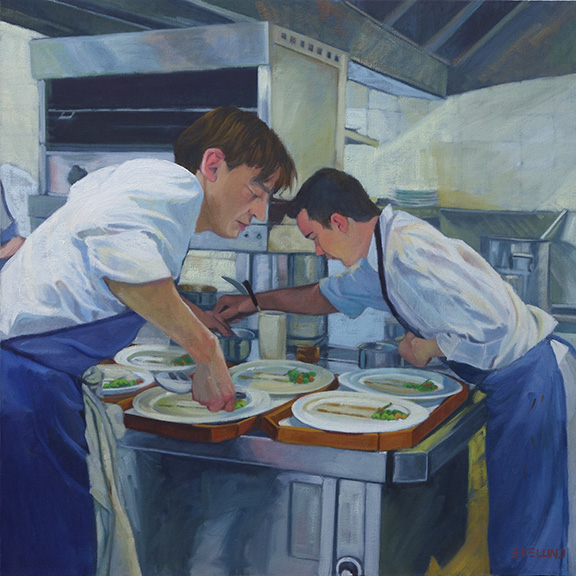
2017 The Rush is On, oil on canvas 24x24


2010, oil on canvas, 24x24

2016 showing repair and mounted on board (bad lighting lightened up the overall image)
This painting is 6 years old. There is nothing major wrong with it for where I was at 6 years ago. A year or two ago I had hung it in a place where I could look at it with the thought to revisit it. If a painting hasn't sold, it is always fair game. For whatever reason, it fell off the wall one night - it woke me up- and on it's way down, hit a few places and in one particular sensitive area ripped a substantial hole. I could not decide if it was worth fixing or if I should just chuck it. I researched repairing paintings. So many different approaches. Some said do not patch an area as it will shrink at different rates and then will always looked patched, so reline the whole painting. Others said patch and you will be fine! The repair kits I found were nowhere near a 24x24" size. This particular painting was cotton canvas on the 1.5" profile of stretcher bars. Not my favorite painting surface.

After much contemplation, I took it off the stretcher bars and glued it to a gator board trying very hard to line up the edges of the tear across the front waiters forearm. I filled in the area with a bit of gesso and lightly sanded the area. I could not sand it smooth as the texture of this canvas was rough. I tried refilling the area and sanding again. All I can say is that it is as good as I can get it. It was worth trying to save at this point as moving forward I was going to repaint the whole thing. The structure and drawing are pretty good so it should be pretty straight forward. The major issue with the original version from my perspective today is once again a value thing. So in the redo, I pushed the values away from the middle. Not much color shift overall except in the skin tones. I thought the waiter in the back had too blue gray a skin tone so I lightened up his face overall and to his arm in the shadow made it a reddish blue.

There is something about the original version that I still like but overall I am still happier with the redo.

Thursday, December 22, 2016

Having Fun with Old Works -7-7-15

I found this old draft for a post that I never uploaded. Since it is the holidays and I would rather not post something new right now, I am going to put it out there as originally written with a few added adjustments.

The other day 18 new, large canvases arrived. Two large boxes and one thin medium; and nowhere to put them. It really made me realize I need to move some paintings as I tried to reorganize the basement.

These are the first I grabbed to work on today. I hope to work on the rest during the week as I have time. Some of these don't look so bad in their original state but over the years I have dinked on them, sometimes much to my chagrin.
Last Harvest 2003, 9x12, oil on linen
Last Harvest, 2015, 9x2 oil on linen
For the Acorn Squash, I remember when I first did this piece I was trying to create energy; No one has paid much attention to it over the years so I felt I had nothing to lose by reworking it. After seeing the "remake"  however, I think the purple cast shadows are too much of a distraction and I miss the energy aspect. I think this one may get my attention again...

The "Sagebrush" paintings were done in bright late morning sun. Although the painting itself is "not bad" it does not really give you sense of that bright overhead light. That is why I brightened up all the foliage and flowers and darkened down the top part which was not doing its part in the original. I also took some of that orange red of the flowers and wove it through the rest of the flowers for a feeling of continuity.
Sagebrush, 2008, 12x9, oil on linen


"On Berthoud Pass" we have a decent plein air painting; It does give a sense of distance but not a sense of rain. I was painting in the rain. I also tended at that time to put a lot of color shifts without thinking of the values. If the colors stay within the overall value (value = on a scale of 1-10, white to black) of the object(s) then it gives a sense of unity. My original has strips of color which is distracting to the whole.  A side note on this painting: my mentor, Kevin Weckbach, came to my recent open house and picked this painting out as a perfect example of edges that are working. He knows how I struggle with this particular aspect of painting and he said I did an amazing job and that I needed to keep it not sell it. High praise indeed!
On Berthoud Pass facing North, 2006, 6x8, oil on linen