Search This Blog

Showing posts with label studio; work in progress. Show all posts

Thursday, August 1, 2019

Waterlily in progress

Here is where I ended up yesterday. I keep saying I really like the block in process and continue to hope that I can maintain the abstract quality and yet I rarely "succeed" in my own mind in doing that. It isn't that I don't like the finished product, but I can't seem to keep the under painting from adding that certain something that is in the block in. On this one the windows are showing through at the top giving it a grid pattern that continues here and there down the painting.

The image below is where I started to photograph the progress. I turned the unfinished painting underneath to its side so the the face wouldn't distract me.
Continuing to block in the greens around the water lily so as to get a better feel for the pattern I was wanting to get. ie a circular yet not a halo effect. Still leaving the orangish color of the figure's skin to help keep it from feeling too green.
Adding the darks of the water and more outlines of the lily pads to prepare for finishing the whites of the lily.

Friday, July 20, 2018

inspired by another artist's blog post

A blog post from Oil Painters of America came into my inbox the other day and the title caught my eye so I did open and read it. The title was Becoming a Better Realist Painter thru Abstraction or something close to that. I do believe that to be true but I wanted to see what this artist, Larry Moore, said about it. I found his article very well thought out and pertinent. Since I have not been at my own easel much this summer I decided to start doing some of his exercises to get the juices flowing. I started with the continuous line drawing. It has been a very long time since I played with that. Here are my attempts. The first two were with a sharpie pen, hence the spots on the following pages before I switched to pencil. His examples were more simplistic landscapes and I chose flowers in my garden. Flowers with one line is a challenge to be sure but it was a great exercise. The last one is of African Violets of which I had hoped to get some of the leaves in but I could not figure out without lifting the pencil. It is easy to paint yourself into a corner if you don't think it thru ahead of time and that is part of the challenge. As I wrote this I now realize a way to have done that but my logical mind got in the way. I just didn't figure that out until now...just do it! Go through the flowers or whatever it takes. That is part of the abstraction and letting go to see what happens. Happy shapes!


The next day I decided to play with abstract in oil. Here is my first go, where I painted over a plein air painting. It is not finished yet but you get the idea. The inspiration for this is from a photo a friend of mine from the 6th Grade when we lived in Orleans, France posted on FaceBook a few years ago. It was her father's collection of the different toilet papers from his jaunts into local toilettes. Who would have thought to do that? Pure Genius. I actually laughed out loud when I saw the photo as I remember all the different colors and textures most of those textures have never touched most American bottoms I can tell you that for a fact. Those shiny brownish ones were more like waxed paper than not. This is not something one forgets. I still have the horror of having to use what we called a "turkish" toilet and essentially consisted of a hole in the ground with two pads either side of the hole for your feet and only the shiny waxy toilet paper. One square at a time. I would say the average size was 4x4 or so. And no door. I could look outside to the parking lot. Not fun for a 10 year old girl. So who thought an abstract could bring back such fond memories? I always wanted to paint that memory she sparked. I still want to add some layers to it to see if I can pull of the translucent aspect of the waxier papers. The pink and blue were more like thin paper towels. None of these came on a roll.
on that note I will close for today...
oh what to name you? 12x9, oil

Thursday, February 15, 2018

A Journey Back in Time

Earlier I had mentioned that I was on a roll and had started all these new pieces. So here is another one of those starts from early January.

Last year about this time, I went through all the old slides my sister had pulled out of our mother's closest when she died 10 years previously. They had been in my basement all these years as I did not quite know what to do with them. Should I just toss or should I take the time to go through them all? Our mother was a traveler and I knew if I took the time to look at what was there I would find some treasures. They were still in the trays from her old slide projector and meticulously documented where they were taken and when.

So, after going through her slides, I also went through MY slide collection. I had quite a collection as well. Once I sorted through both collections, I picked 50 or so to take to Costco and turned into digital images. This is the second image from my mom's slides that I have picked to paint. This one is from France in the mid 60's. She is in the painting with her close French friend, Beatrice at Beatrice's family farm in the countryside outside Orleans, France, where we lived for 5 years. I picked this image to do for a number of reasons. One, it is my mother as I remember her as a preteen. Beatrice was a woman she met at the Franco American Club, a place for women to meet and cross the cultural divide in new friendships formed. Beatrice became part of our family and after we left France and moved to Germany, my mom often went back to visit Beatrice. I know, because I went with her once.

I was asking myself this question the other day? Is it strange to paint from old photos? Are they dated somehow? I am betting this farm house is still standing and hasn't changed all that much. I wish I knew exactly where it was located.

Here is the progression to date:
Peg and Beatrice, 20x30, block in stage
Peg and Beatrice, 20x30, oil, coming together
The slide made digital image is overly purple. I tried putting different filters over it to see what if any improved it or made it more natural looking, but none of them improved it enough for me to want to go that direction. I am enhancing the warm oranges that are already present and graying down the overall purple color. Believe it or not, that is what I have done here and it still appears purple, but I am okay with it.

Thursday, October 12, 2017

Crossroads - in process

Crossroads, 36x48, oil on canvas
I am still working on this painting, the largest to date that I have attempted. This year has been one of great transition and I feel like I have been at the crossroads for quite some time now. Once I pick a direction another crossroads is before me. My 'plan' for this piece is to keep it very abstract. It was also to be another attempt for me to allow the under-painting show through for a layered effect. My intention was to document each layer to track myself. However, as is often the case, once I get working I do not think to stop and take a photo. I am very pleased with the fact I still have some of the original under painting showing through as I fight my tendency to cover it all up with the new layer. The left side is a bit more complete than the right at this juncture.
Here we have my first layer which took on a rainbow theme. IF truth be told, I was cleaning off my palette, but who needs to know that? I still thought it would create a nice color transition going across the canvas. This next image shows my beginnings of blocking in and placement of the crossroads. How high, how wide, how thick, how thin. You would not think something so simple would require much thought, but as I work on this piece, it has a mind of its own and I find myself going in directions I had not initially even considered. It has been a wonderful journey thus far despite many roadblocks. One of self-discovery. A road trip without ever getting into the car...

As I write this, it is drawing me back and into it.


Thursday, April 20, 2017

Reading on a Jet Plane

Reading On A Jet Plane, 20x16, oil on panel

Sung to the tune of "Leaving on a Jet Plane, Don't know when I'll be back again..." I could not help myself with this particular title.

Another more challenging painting for me as it is back lit which makes the figure a silhouette. And most importantly, painted from a 4x6 photograph as this image was taken BEFORE digital photography!  I just never got around to painting it before, being spoiled with technology. It doesn't seem that long ago but counting back, it has been 16 years since our family went to Germany. This is my son, with his sister by the window. It was to be part of a series I wanted to do on people reading. I think I have done a number of pieces on this theme but never have they been shown together as they do span 20 years now.
Lost in a Good Book, 18x24, oil on canvas, 1996ish with a few updates along the way
For giggles and grins, I will add a few others from this drawn out series. The above painting is of my daughter at 7 or 8 years old. I originally painted it sometime in the late 90's. I did work on it again after that.
@ The Metropolis, 20x16, oil on canvas, 2009
Another one of my daughter. She had agreed to be my model so I could paint her plein air for the Denver Plein Air Event back in 2009. I did a 9x12 while she patiently read a Charles Dickens novel (Great Expectations?) all for a cup of coffee. I did this larger piece in the studio and it won Best of Show at the 'Own an Original' juried show at the Littleton Museum. It also sold at that show, which is always a wonderful thing for an artist. The gentleman who bought her said she looks like his daughter.
The Butcher's Son, 6x6, oil on panel, 2012
To throw in a non-family member, here is a young boy reading at the Dijon, France Saturday market. His parents had a butcher shop and he was perched between to cases of prime meats of all kinds.
Liz Reading, 20x16, oil on canvas, 2009?
Here is another one of my daughter when she was in college. It may be 2009 as well (no date on the back). I did this one from life sitting on the couch opposite her in our living room.

Monday, February 20, 2017

Green on Green


You might ask, why do I keep painting over old works? Do I not have clean canvas's to start anew? Sometimes, yes I am out of a certain size of canvas or board so I scrounge for a piece that can be sacrificed for the greater good. Other times I choose to use an old painting because it is not worth saving in my opinion and I want to have the colors to come through on the new painting. A quick way to layer color, in other words.
Developing stage 1
Wishing to once more play around with bottles of varying colors of green, I started this piece over an old study I had done awhile back for a larger painting. (See bicycle with balloons below) I wanted to keep some of the color coming through.
Developing stage 2-getting some darks in
I began with a piece of greenish blue rice paper that I set down on the table. I then found 5 greenish bottles out of my collection that worked well together. To block out the background I put up the Japanese doll screen and used the back as the backdrop. It is a light greenish neutral color. Loosely sketching in the bottles I then used blocks of color to quickly block out the distracting balloons and bicycle leaving bits of color and line to show through. Really liking it at this stage and wondering how far do I want to take it?
Stage 3-more form
Proceeding rather cautiously at this stage as I cannot decide what to leave or what to cover. In person, I like the stripes going across the gold label on the right. But in the photos posted here, I am not liking them much. Overall, I do like the way the painting is right now and do not want to get too far along and ruin the energy it has. Any comments on that? Should I leave the line between the bottles on either side and the one in the middle (my sketching guideline)? Does it add to the composition or detract from it?
Green Bottles, 14x11, oil on panel
Writing out my thoughts in questions really helped me decide what I wanted to do. As you can see in the finished painting, I took out the sketching guide although there is a hint of it left. The dark lines across the bottle on the right also came out but not in the background. I should have been able to paint this in one sitting, but I took my time on it so that the likelihood of me getting carried away might be tempered.  Working on it in small bite-sized pieces.

Tuesday, January 24, 2017

The Rush is On

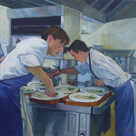
Starting with the finished piece first and then the explanation for a change. I repainted this piece over three or four days while also working on a few other paintings. It took me a bit longer than I expected as I thought I would only "fix" a few areas. I don't think I left anything untouched except the hair on both of their heads.
2017 The Rush is On, oil on canvas 24x24


2010, oil on canvas, 24x24

2016 showing repair and mounted on board (bad lighting lightened up the overall image)
This painting is 6 years old. There is nothing major wrong with it for where I was at 6 years ago. A year or two ago I had hung it in a place where I could look at it with the thought to revisit it. If a painting hasn't sold, it is always fair game. For whatever reason, it fell off the wall one night - it woke me up- and on it's way down, hit a few places and in one particular sensitive area ripped a substantial hole. I could not decide if it was worth fixing or if I should just chuck it. I researched repairing paintings. So many different approaches. Some said do not patch an area as it will shrink at different rates and then will always looked patched, so reline the whole painting. Others said patch and you will be fine! The repair kits I found were nowhere near a 24x24" size. This particular painting was cotton canvas on the 1.5" profile of stretcher bars. Not my favorite painting surface.

After much contemplation, I took it off the stretcher bars and glued it to a gator board trying very hard to line up the edges of the tear across the front waiters forearm. I filled in the area with a bit of gesso and lightly sanded the area. I could not sand it smooth as the texture of this canvas was rough. I tried refilling the area and sanding again. All I can say is that it is as good as I can get it. It was worth trying to save at this point as moving forward I was going to repaint the whole thing. The structure and drawing are pretty good so it should be pretty straight forward. The major issue with the original version from my perspective today is once again a value thing. So in the redo, I pushed the values away from the middle. Not much color shift overall except in the skin tones. I thought the waiter in the back had too blue gray a skin tone so I lightened up his face overall and to his arm in the shadow made it a reddish blue.

There is something about the original version that I still like but overall I am still happier with the redo.

Wednesday, October 12, 2016

Silhouette of a parakeet

Peepers, 9x12, oil on panel block in stage
Here is a painting over a false start. The green and orange come from when I had played with an abstraction of a sea and beach scene but it was not successful. I thought it might be an interesting color to have underneath this portrait of my daughter's parakeet taken in winter. The white shapes are the sky and snow on buildings and fences. I want to get some snow scenes done in time for winter so this one was just to see what I can do with a silhouetted white parakeet against a snowy background. His attitude is already in evidence, that is for sure. He is very curious.
Peepers with color added, 9x12, oil 2nd stage
Here is with some color added and filling in the shapes I had blocked in above with the white. He is still looking a bit plump for such a little guy so I tried to shave some weight off of him and yet keep the overall shape. He has a deformed foot from being in a large cage with so many other birds. He had been attacked, probably for being different since he was a totally white parakeet. He now has some black on his wings and face and a blue belly. Every time he molts, more color is added, if incrementally.

Finished?, 9x12, oi on panel

Thursday, May 5, 2016

Flooded St Johns River

Flooded St Johns River - Fall, oil on linen, 24x30

Here is a painting I started a year ago. At that time I thought it was pretty much done but then I did a touch up that just destroyed it for me. It wasn't much but it doesn't always take much. Into the closet it went, face to the wall!

Feeling like it was time to salvage that 'so close and yet so far away' piece I got it out of 'time out' and decided to take a whole new approach to it.
Original "finished" loose painting
In the first rendition I was going for a loose, impressionistic approach, which as many of you know is not really my style, but sometimes you just have to get out of your comfort zone and try something foreign. I enjoyed the loose strokes and thought it a successful painting. Until I decided to darken and add depth to the trees at the water line. UGH. I used an almost black color and it just killed the painting for me. Not a hard thing to fix but I could not face it. So be it. I also felt that the reflection was getting too fragmented and not reading so much as a whole shape.

On this approach, using the same painting, I decided to break up the loose brush strokes with smaller, more directional individual strokes but still keeping the impressionist tone to it. The scene just calls for that. But this approach is also not 'normal' for me. I have done the broken stroke application before but I am still feeling my way around it. It certainly has its place I am discovering.

On this second run through I had finished it but it seemed to have taken on a somber tone that I was not thrilled with so I did another pass through lightening the colors back up. It is still a bit somber from the original finished painting, but for now I like it as is. Who knows what tomorrow will bring?


Block in for St Johns River-going for large color shapes

Wednesday, April 20, 2016

On the easel: Inspired by drive down I-70 from Vail

Vail Pass Descent, 30x30, oil on linen

Last Thursday and Friday I was in Vail for the FBLA (Future Business Leaders of America) State Conference. On Thursday I judged the Graphic Design competition and on Friday I helped in headquarters. The storm reports for Friday-Sunday were getting more and more horrendous so it was recommended I leave sooner than later. When I left Vail it was not only snowing and hailing but also thunder clapped. Hitting Vail Pass it was clear, although not sunny. This image is coming down from Vail Pass. Just before getting to Frisco I hit a white out. That was quite terrifying and took all my concentration. I slipped in behind a semi-tractor trailer and prayed he could see better than I could.

I wanted to get this painting started as not only is part of a new series I want to do, I wanted the freshness of the memory from the drive.

My first thought was to do this painting 24x24 but after looking at that size decided it was too small. Even 30x30 is looking a bit undersized but I don't want to go out and get a larger canvas when I have so much stock on hand. Plus, this is a good size for me. I must admit though, the more I work on these larger for me sizes the smaller they are tending to become.

This one started as per my usual approach of very thinned down paint color to just get the canvas covered and the big shapes blocked in. Then I go with a bit thicker paint and correct the drawing if that is needing to be done. There usually is some adjustments. Then I really start to lay on more color and paint. This is as far as I got but I am quite pleased with it thus far. I love this stage in the development. I could start paintings all day long. Just don't ask me to finish them...until I am good and ready.

Thursday, April 14, 2016

Blockin Pelican develops into struggle

Pelican Block in, 24x24, oil on panel
Pelican structure, 24x24, oil on panel
Loosely blocked in on the slick oil gesso I had put on the Masonite, makes for a very thin coverage of paint in the first photo. I am now building up paint layers. I added that sea green color to the sky to be under and behind the darker blue gray clouds that are building up in the sky and will pop the pelican's head out. I solidified the river's light color but I will be adding the darker edges of the waves that are rippling with the wind.
 I am still undecided whether I will leave the trash can in that is peaking out behind the tail feathers. I thought it might be a good balance to the beak but know am not so sure I like it. It seems to be competing instead of complimentary. There were two figures on the bridge that I have so far left out. One figure is fishing and has his back to the viewer; the other is peaking out from behind the pelicans shoulder and looking over his shoulder at the viewer. My husband said to take them out but I am not yet convinced they don't belong.
Pelican Drawing Correction
The Pelican's head, neck and beak just felt off to me so I had to redraw the whole thing. The only part I did not move was the back of the head and neck. The bird's body didn't seem able to support the head. I think the proportion's are better. I finished blocking in the feet and legs, too. Good drawing is so important to the whole painting's success. I was convinced I should take out the trash can but now I am waffling on it...again.

Those nice straight lines that I like so much will most likely be softened once I get down to really laying down the color. The slick surface forces me to layer, which is a good thing. I like having the depth of color. I still struggle with the good coloring book syndrome of 'keeping within the lines.' Which for me translates to cover everything flat within those lines, ie not allowing the underlying colors to come through. It is a challenge for me but I have been working so hard on that aspect I think I got it. It is my yin and yang fighting! In one sense I like the rigid Mondrian linear quality against the organic shape of the Pelican. Then I think, flatten down the Pelican to a more abstract linear image to go with the other lines...Then, no, soften edges! I am still not sure which side of me is going to win the fight on this particular painting.

Monday, December 14, 2015

A new painting emerges

A bit of a story to this post. I have a painting I did a year or two ago where I played with abstraction. I had it hanging at the office for fall as it is a scene where the dawn light was casting its long fingers across a street in the river town of Migennes, France. I was out looking for a patisserie to bring back breakfast. I am an early riser, even on vacation. One of my co-workers asked me if he could make a comment on the painting and of course I replied yes. I am always thrilled when someone looks at my work long enough to want to comment. He told me that the foreground of the road bothered him because there wasn't enough interest at the entry point into the painting. GREAT observation. So I took the painting home that weekend and fixed the road. Unfortunately, that little fix was leading me into wanting to repaint the whole thing as I am not in the same place I was when I painted it. On this particular painting I wanted to leave it alone. I was and am happy with it 'as is.' Here is the original painting with the road repaired:

Migenne at Dawn, 18x24, oil on panel over old painting. Available
Not on my agenda that weekend was to start a new painting, same subject, but that is what I ended up doing. I was jazzed! I found another old painting, same size at 18x24, on which to paint. I found out through this process that it is a different result depending on if the original painting ever had varnish on it or not. The painting above had varnish. Even with removing the varnish, the paint is still tacky so the brush glides over it and sticks. Which is the effect I like in the above painting. The new rendition over another old painting did not ever have varnish on it so it was like painting on a fresh canvas.
I took photos along the way so you could see how it works. I had intended to make a slideshow out of the progression so it would not involve so much scrolling but the latest versions make it so much harder than the easy Picasa I used for all my slideshows in the past! Maybe I will figure it out but today, it is not happening and I have been messing with this for weeks and I am over it.
1. I don't have the original painting but in this first image it is mostly there. I have drawn in the basic structure of the new painting and blocked in the outline of the new sky.
2. Here I have added the road and some guiding lines of the gutters. The roof color is already as a wall and the chimney looks like a door.
3. Here I have added walls in two different values. One color for the walls in the light and another for the same color walls in shadow.

4. Finishing up more houses. I do like how the trees work with the composition of the new scene.
5. Roofs are coming into play and the side of the orange building with its basic structure and the sidewalk on the left is no longer tree colored. The chimney pots are taking shape as well. The growth is tied to big blocks of color.
6. More roof's and finishing up another house to the left.
7. this photo was taken after dark so it is studio lit. I did not want to stop yet so that is why the colors look a bit yellow. The houses at the end of the street are coming in. Oh how I struggled to want to cover up the trees but it had to happen. Windows are being shuttered as the town is still asleep. The car shape is added.
8. Day 2: more details. Windows, roofs and car. The sidewalk is finally put in on the right as is detail on the wall. I changed the color of the beige walls that are shadow. They were too warm in color. I am starting to shape the green bushes.

9. working on color shifts. I thought the roof was too green on the tall house. Added more detail that is particular to France.
 10. Minor changes here. Starting to work on the greenery on both sides of the street.
 11. This is where I stopped. I am not finished. I don't normally paint in such a methodical way. In this case it had to be or I would have been lost in the trees, no pun intended. Now that I have the structure in the next step will be to force some areas and tone down others. I don't yet get the feeling in this version that it is dawn. The road needs more visual interest and the bushes on the right need better definition of being bushes in the dawn light. They are a bit indistinguishable for my taste. In other words, not reading right. I will post the finished piece when I get there but this is where it ends for now. It is the way of the artist. I need a break from this piece as I work on others. That way I can let these ideas simmer until they are ready to be manifested.

Friday, September 25, 2015

Critique Study

The Critique, study for, 12x9, oil on Panel, available
Here is a study I did for a larger piece I am now working on. It is a "dark/light" pattern that I have spoken of before. If you squint your eyes you will see that every shape is either a part of the dark shape or a part of the overall light shape. I am staying away from medium values to create this pattern. The only medium here is really the light on the sweat shirt of the figure on the left which I will darken down in the larger painting. In this study it is tied to the darks but not quite enough so.

The head of Kevin transitions from the light into the dark pattern, as does his arm. Against the light background his arm groups itself with the dark pattern, but against his shirt and the painting he is holding his hand transitions to the light group. I love working with dark/light pattern. If done well, the painting is so much more interesting to me.

Monday, August 17, 2015

Janice Nowinski Workshop Day 2 and 3

Day Two: I decided to start a new painting and leave the boats for now. I was a bit confused by the end of day one so I brought in a larger board and decided to go graphic with big simple shapes. I used a photo of my son since figures seemed to be the modus operandi. It is a photo I had taken to be part of a series I had started on reading years ago but had been distracted from completing. I started this series before the iPhone came on the scene but I have kept those photo references in an envelope as I add to it in case I revisit that series. NOTE: an ironic addendum to this. In yesterday's WSJ was an article on the decline of summer reading from its apex after WWII. The link to this article by Lee Siegel is not available but when I did a search I see that this is a recurring theme of his. I realized I had read other of his articles on this topic on the decline of reading books.
After quickly blocking the shapes in on this very slick surface I was ready to correct the relationships and start painting. It was suggested that I leave it as is. So I did. After looking at it awhile I think I did not have the right proportion board in relation to the photograph. My math is off, in other words. That is one reason I think the hands are so large. I can't find the photo to verify this.
I think this piece has potential. It was well received as is and deemed complete by the class and by Janice. Not sure I agree. You can judge for yourselves. What I may end up doing is starting a new one instead of my normal reaction to over painting the original. That is something Janice suggested that is starting to make sense to me. So there is a takeaway from the workshop.
Reading On a Jet Plane, 20x16, oil on slick board, 20x16
When I took these pieces to work one of my coworkers really liked this painting as well. Another coworker asked why I was taking a workshop and not giving one? Good question...Amazingly enough I had an email yesterday asking me to go to WI to give a workshop. I'm thinking on it.

Day Three:Another figure. I wanted to see what I would do with editing an image and not being so *literal in its translation. I left out quite a bit from the photo reference and am quite happy with this one. No one recognized it as the wall sculpture outside the Denver Art Museum. I don't think you are supposed to climb it but one day where I was meeting a friend, someone did!
Here are some photos from the critique at the end of the third day:
All three of these paintings were done from black andwhite photos. Nicely done, too.

Sampling of works completed during the workshop.

More critique...love the translation of Matisse.
*Note: "literal" became one of the hot button words of the workshop-not sure we all agreed on what that word means. I had to define the term "graphic" more than once when I used it to describe my work. Another interesting topic for another post. How we think we can redefine words to fit our own definition.