Search This Blog

Friday, October 19, 2018

The Laguna Beach Art Association Exhibit

Last week I flew to SoCal. One reason was to see the Laguna Beach Art Association Exhibit at the Laguna Art Museum. Edgar Payne was one of the main founders of this art association which started in 1919. Here is a painting by Edgar Payne hanging in the exhibit. There was also a magnificent large painting from the Sierra Nevada's.
Here is my most favorite "new" artist for me. I had never heard of George Brandriff before but these two paintings are both by him and I love them for different reasons. The top one has such an amazing composition as well as being very luscious in paint application. The second one I thought had particularly well done abstracted shapes that made up the whole.

detail of the abstract handling of this painting, Sunday Reflection, 1929

Here is another new to me painter, Frank Cuprien. This painting that at first I did not really like. It took some getting used to. It comes off as so Yellow. But the longer I looked at it or tried to ignore it (both) the darn thing kept calling me back for closer inspection. And upon further reflection it too made me marvel. The foreground water is a light wash over a wonderful palette of soft pastel under-layment which is thicker in texture. I learned that Frank built a house on a hill overlooking the ocean and was known for just painting water. This painting is from 1930.

Detail from Poeme du Soir, Frank Caprien
Thomas Hunt, Newport Harbor Scene
I like this Thomas Hunt, another artist I had not heard of before, Newport Harbor Scene, as it is so graphic and simple. With the blue flag hanging down out of the top frame. Very 'edgy.' There was one other by him, also boats, although more abstract than this one.

I did not take a photo of the tag for the painting below so I do not have that information to share with you. I guess you will have to go see the show if you want to find out! It is up through early January I believe. And it is well worth a visit if you are in the area. I really enjoyed the exhibit very much. I took the photo because I liked the abstract shapes of the porch and laundry and the colors used (a wee bit of glare there). I also thought the palm tree rather lovely with the warm browns in there. Not something you see painted in on palm trees too often.


To round out this first post on this exhibition of newly discovered painters for Victoria,  I will close with Ruth Peabody. I think her style is more reminiscent of the time period in which she painted but I did like her work.
Ruth Peabody, The Cookbook
I found out about this show through American Art Review a wonderful magazine that highlights shows around the USA every two months. I find a show that interests me and then figure out if I can go. My sister moved to just north of LA last year so it was a perfect marriage to go see her and her new home and go see this show.

Wednesday, October 10, 2018

Cortona Italy


oil on linen panel, 15x30

Here is a scene from a trip to Italy I was on a few years back. It is in the Tuscan town of Cortona. One of the many walled used to be city states.  I was taken by the colors and the building block effect I saw as I came down a hill towards the main square. We were only there for a few hours, but in that time we went to a private wine tasting, the sprawling street market and explored many of the side streets away from the main tourist sections. Yes, there are still places in a small town to escape the disgorging of tourist buses. Even if that area seems to be shrinking daily. 

I have no name for this painting yet so if something comes to you, please let me know.

Monday, October 1, 2018

Rembrandt at the Denver Art Museum


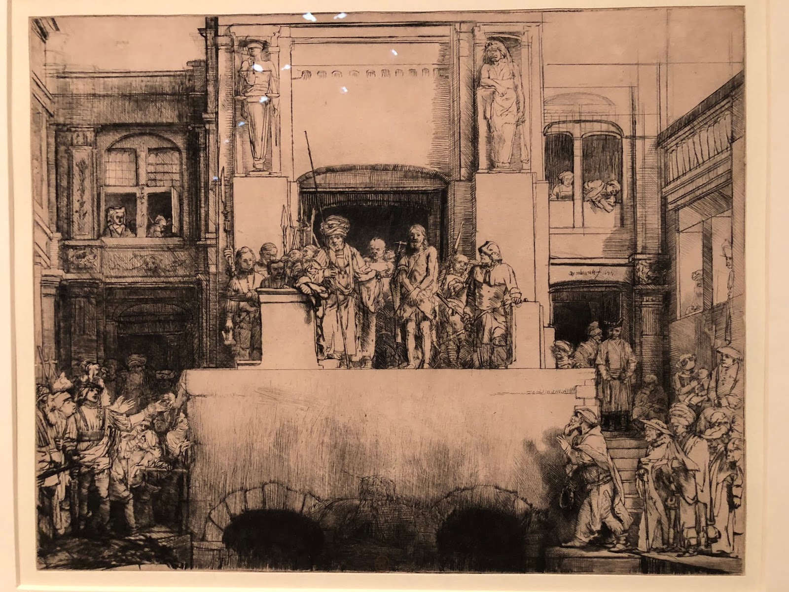
Rembrandt - Painter as Printmaker is currently showing at the Denver Art Museum. I went to see the exhibit Friday morning with a friend. If I needed validation in redoing paintings, I got it here. This is one prime example of Rembrandt redoing a plate. As shown in the tag, the top one was the 3rd State and the bottom is the 8th State or rendition. It is like doing one of those puzzles as kids to find out what is different between two pictures. He made some major changes! There were many examples of such plate states. This particular one was larger than most and so much action going on.

To be fair,  Rembrandt often changed the plate for a client. So someone who may have liked the overall theme of this print may not have liked the crowd scene so it was removed. Or wanted more architectural details, so those were added. It was a fascinating display of an old world master. Some of his early prints were barely 1.25" x 1.25" and yet with remarkable detail and emotion. It was gratifying to see so many people there engaged in his mastery of his medium. And not just mastery but a leading edge on technique as well. I highly recommend going to see this exhibit. It is up through early January.


Friday, September 28, 2018

New Years Day-Roxborough

New Year's Day- Roxborough State Park, 16x20, oil on panel
So Here We Go Again. I had just decided to not do anymore 'before and afters' on my blog. Afterall, I consider myself a 'professional.' Professional artists don't make mistakes of such an egregious nature. Of do they? I know this artist does.
2 or 3 years ago version
But then last night I had a call from a dear friend of mine. She is also an artist and I value her input and her eye. As we were talking she mentioned how helpful she found my 'before and after' posts. That they contain valuable information. Jeez Louise. Now what? I laughingly told her how I had just vowed to do no more of those as I spent the last week or so excitedly redoing paintings I found to be flawed in one way or another. Some of them I wasn't even sure what it was that bothered me but I just knew they were  not for public consumption. I was telling how much fun it was to all of a sudden 'see' with such clarity what was wrong in a number of these 'face to the wall' paintings.

Here is one such failure. The bottom one was done from a photograph (yes, you read that correctly. A 3.4 x 5' photograph to be precise). This scene is from before digital cameras if you can even remember back that far. I came across it as I was culling my old morgue file. Before throwing this photograph away I decided to paint it. From a photograph. Like I used to. How we did that is so hard to fathom these days.

Let me start with the fact that the shadows are not united in form. Add to that the fact that the grasses are so bright against the purple and are not reading as they should; that some of those plants are in fact, in the shadows. If I remember correctly, I was in a hurry when I painted the original. Looking back I do see that the photograph is brighter like the original version is. So at least I got that right. That dark bullseye purple shadow in the middle did nothing but detract from the whole, drawing your eye right to it. How did I miss that?

In the new version my first step was to change the sky color. I darkened it down a wee bit in value and put some violet in it. Then on to unite that shadow shape and tone down the purple, adding value and temperature shifts within the shadow. Adding a variety of plants-they are not all grasses! In the plants I added greens and cooler yellows and some deep reds as well as keeping some of the oranges and warmer yellows. I remember that originally I wanted the deer to blend in to the scenery and now on this version I want them to stand out. Even though it is not overall as bright and sunny as the original, I believe the new toned down version reads better overall. And if I did not show the original you would not know the difference. It is always a crap shoot redoing a painting. Always someone who prefers the old vs the new. But though I may still decide to brighten it up and add more warmth to it I am much happier with it now.

Friday, September 7, 2018

The Path Less Taken

I am back! It has been awhile. It isn't that I haven't been painting. It is that I have been unable to believe that anything is finished...is that being stuck? Or is it just that I have been too distracted with other projects that this area of my life has suffered? If I am honest, it is both. It has been a summer of electricians, contractors, energy auditors and getting roommates. In all honesty, that is enough to keep anyone very busy.
Here is a painting I did last week; another one from my series from my trip to Milos, an island in the Aegean where I went this past Spring. This little seaside path to the sea is in Pollonia.

My son said he really liked it but he wants to see where the path leads. So I may just do a companion piece, but my thought is it leads to the sea and we all have our ideas about what that looks like. That being said, I must admit that the Aegean Sea is like no other I have encountered!

For me it is more about the journey than the destination. It is a sunny day with the threat of a cleansing rain, the island is abloom with spring flowers, and the sea beckons.

After adding the photo above, the image seemed too light. Some of that is from the lighting conditions when I took the photo. But it made me think it wasn't dramatic enough. I put the painting back on my easel this morning and redid the sky as I wanted the piece to have real feeling to it. The only other thing I did to it was to redo the dark hedges along the the horizon line. I wanted them to read more of a unit. Other than those changes the rest is the same. The photo below is darker, taken inside at my easel but is truer to the original than the washed out image above.
Looking for a Title, 12x16, oil on linen panel. Available. Contact me for information
After wrapping this up I blocked in the companion piece. It is the same size, same surface but I am going for a more abstracted landscape approach. Let's see if I can pull it off. I am happy with it so far. Here it is:
Roughed in companion piece

Thursday, July 26, 2018

Clear Wine Bottle Still Life

Keeping in the theme of staying out of my comfort zone I started this still life the other day when my power was off. I was of two minds. Start abstractly but bring it around to a more finished completed painting or try and stop before I get too involved in it.

I grabbed a wiped off painted panel that still had the previous image on it, as you can see the tree in the off centered bottle. The roof line and buildings are still coming through. It was about at this stage that I decided to try to keep some of those elements. My hesitation was that I did not retain any of the under painted image on the left side. But somehow it doesn't bother me. Every time I walked by my easel I was just liking it more and more. I can't tell you how hard it was for me to just stop.

Here is where I ended up.  It was a fun exercise.
untitled at this point, 14x18, oil on linen panel


Friday, July 20, 2018

inspired by another artist's blog post

A blog post from Oil Painters of America came into my inbox the other day and the title caught my eye so I did open and read it. The title was Becoming a Better Realist Painter thru Abstraction or something close to that. I do believe that to be true but I wanted to see what this artist, Larry Moore, said about it. I found his article very well thought out and pertinent. Since I have not been at my own easel much this summer I decided to start doing some of his exercises to get the juices flowing. I started with the continuous line drawing. It has been a very long time since I played with that. Here are my attempts. The first two were with a sharpie pen, hence the spots on the following pages before I switched to pencil. His examples were more simplistic landscapes and I chose flowers in my garden. Flowers with one line is a challenge to be sure but it was a great exercise. The last one is of African Violets of which I had hoped to get some of the leaves in but I could not figure out without lifting the pencil. It is easy to paint yourself into a corner if you don't think it thru ahead of time and that is part of the challenge. As I wrote this I now realize a way to have done that but my logical mind got in the way. I just didn't figure that out until now...just do it! Go through the flowers or whatever it takes. That is part of the abstraction and letting go to see what happens. Happy shapes!


The next day I decided to play with abstract in oil. Here is my first go, where I painted over a plein air painting. It is not finished yet but you get the idea. The inspiration for this is from a photo a friend of mine from the 6th Grade when we lived in Orleans, France posted on FaceBook a few years ago. It was her father's collection of the different toilet papers from his jaunts into local toilettes. Who would have thought to do that? Pure Genius. I actually laughed out loud when I saw the photo as I remember all the different colors and textures most of those textures have never touched most American bottoms I can tell you that for a fact. Those shiny brownish ones were more like waxed paper than not. This is not something one forgets. I still have the horror of having to use what we called a "turkish" toilet and essentially consisted of a hole in the ground with two pads either side of the hole for your feet and only the shiny waxy toilet paper. One square at a time. I would say the average size was 4x4 or so. And no door. I could look outside to the parking lot. Not fun for a 10 year old girl. So who thought an abstract could bring back such fond memories? I always wanted to paint that memory she sparked. I still want to add some layers to it to see if I can pull of the translucent aspect of the waxier papers. The pink and blue were more like thin paper towels. None of these came on a roll.
on that note I will close for today...
oh what to name you? 12x9, oil