Search This Blog

Showing posts with label Museum shows. Show all posts

Monday, April 10, 2023

Sargent at the Legion of Honor


Detail from Landscape below

Detail from Landscape below

Spanish Hills-details above

Stunning light!


A familiar one
I am a late in posting about this exhibit, but there is still a month or so left if you happen to be in or near San Fransisco before May 14th, 2023. I was there last month, working a visit to the Legion of Honor into visiting family. It is funny how I manage to do that! (It was a rainy day or else we would have also taken the trail along the cliffs from the Legion of Honor) This is my third out of state trip to see a John Singer Sargent Exhibit  (two were in NYC and Brooklyn). This one focused only on his time in Spain. https://www.famsf.org/exhibitions/sargent-and-spain  He was so prolific there has been very little overlap in going to see his works. Thankfully, he had the ways and means to paint as much as he wanted, and we are all the richer for it. 

Sargent sure had a way with color and light. Some of these paintings positively glowed from across the room. Thankfully the day we went it was busy but not crowded so one could see both close up and from across the room. And take ones time. These are just a few examples of what caught my eye. The landscape was atypical for Sargent in my experience, but so rich in color and nuance. The last three above from the fountain to the girl walking down the street, show the continuity of his palette and how he can make the light around the fountain dance as well as light up the street from a distance or bring to life the Alhambra using very similar color mixes yet achieving very different effects.

The only disappointing aspect of this exhibition was the 'swag' being sold. The postcards chosen for reproduction did nothing for the paintings they represented and usually postcards are the better than what is printed in the books.  I tend to buy coffee mugs as I travel, and the only mug was of one of my least favorite paintings in the show, a pomegranate tree. Even my old iPhone captured the light dancing around the fountain with the beautiful reflected light! This is the third exhibit (Alice Neel at the deYoung Museum in SF and recently here at the Denver Art Museum) I have gone to in the last few years where the quality has decidedly gone down in the Museum gift shops...I can't figure that one out. Cost more, quality sadly lacking. What could possibly be the excuse? I noticed I wasn't the only one walking out without buying anything, not that I believe that to be unusual...

Friday, December 13, 2019

Life Imitating Art - Baumann

Life Imitating Art - at the Gustave Baumann Exhibit, 36x18
I have been working on two paintings simultaneously over the past several months but they were interrupted because of the welcome pet portrait commissions. I just received the final approval on a dog portrait so it is now drying awaiting varnish.

If you saw the link going around on Facebook from a photographer who took photos of people imitating the art they were looking at, I just want you to know these two paintings were started and this one almost finished, when I saw his collection. I did feel a bit gypped. This has happened to me before...where I get this idea and am in the middle of a painting and then something manifests in some form taking the uniqueness right away. I guess there is nothing new under the sun even when we want to believe it!

What captivated me about this scene is how she is standing like the trees she is looking at as well as the colors matching from her sweater and her skin tone. This one is from a now defunct art museum in Pasadena. It just recently closed its doors. It was a unique concept in that it showed only artists who painted in California, even if they did not reside there for long. There was no permenant collection. It was three galleries and there was usually one contemporary exhibit and two from the past. I had not realized that the Gustave Baumann exhibit was in the second gallery, so it was a very pleasant discovery to be sure! He is best known for his woodcuts of Taos. This exhibit actually included the press he used for his wood cuts as well as examples of the different color blocks. The pictures she is looking at were gouache, I believe. I wrote about the main gallery show, Joseph Kleitsch, if you care to check his amazing work out.

The second painting in this particular series is from NYC. The contrast is striking...to be continued.

Tuesday, November 5, 2019

James Tissot at the Legion of Honor - San Francisco

Recently I had the pleasure of going to this exhibit on James Tissot called Fashion and Faith. I must admit that prior to this point, I knew very little about James Tissot. Over the years I had seen his work sprinkled among a myriad of museums and museum shows and noticed his work, but not enough to delve deeper.
The back story is that going to spend 4 days with a friend in the Bay area and planning to hike and wine taste, I thought to check what if anything of interest might be up during my visit of a more cultured tone. I recognized the painting used on the Legion of Honor's main page for the exhibit so I ran it by my friend and also my traveling companion. They both were up for it. So it was built into our schedule of events.
 This lovely painting was listed as a "study." Wow. Looked finished to me.
One of his "fashion" pieces. His family was in 'textiles' and his handling of the fabrics of his day is stunning. What I enjoyed so much about his group scenes like this is how each face tells a story. Almost as if there was thought bubble above their heads speaking outlaid. It is the first time I can recall where I have seen this phenomena in paintings.
Here is one of many of his painted stories. I do remember the title of this one "Early to the Ball."
Not mentioned in the title for this exhibition is that he was also an official chronicler of the, if my memory serves - Franco Prussian war. I thought the follow painting, done in watercolor, poignant.
Now for the 'faith' piece. While living in London (he was French), he met a young divorcee of 2 children. They lived together until her death from tuberculosis. He was devastated and turned back to his Catholic faith. He had already done a series on the prodigal son but he did a second version of it and also did over 100 watercolors from the new and old testament. Below is our prodigal son asking papa for his inheritance. The faces on the people at table are priceless in their judgement of this request. These same characters are in all the illustrations he did for this one parable. I believe there were 5 or 6 illustrating this reading alone.

In the watercolor series he did, a couple of them were used in movie scenes. I apologize for not remembering the movie from the 1920's that used one of his images, but the one everyone should recognize (I did not take a photo of it however) was a scene he painted with the ark of the covenant. His rendition of it was taken and used in Raiders of the Last Ark.
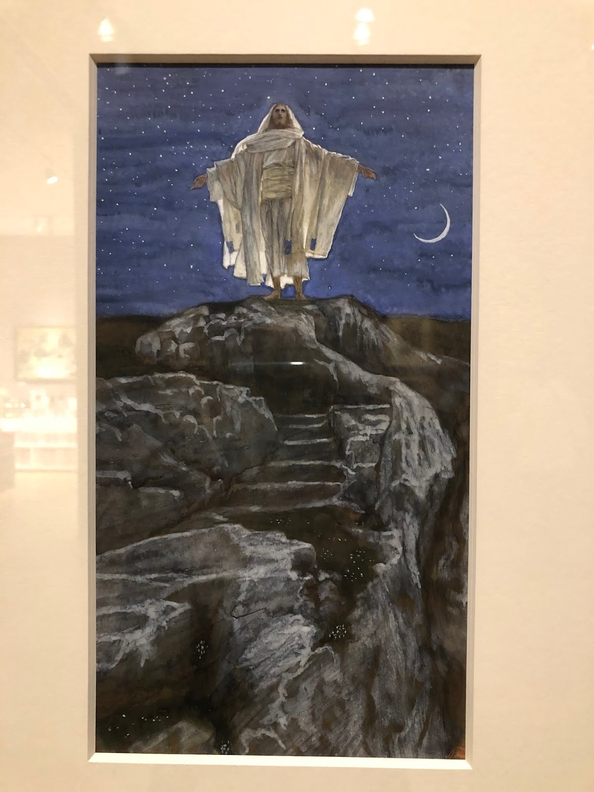
Lastly, here is one that really stood out for me from his illustrations from The Life of Christ; It is Jesus praying at Gethsemane. Never, in my imagination, had I thought of Christ praying like this. Yet it makes all the sense in the world when one really thinks beyond the common illustrations of the Bible we were all brought up on.
If you will be in the Bay area and can go see this exhibit, it is up until February 9, 2020. I highly recommend it. To sweeten the deal, the Coastal trail goes right by the Legion of Honor and on a clear day it is a beautiful hike along the water with the Golden Gate Bridge in view. Nature and Culture!

Wednesday, March 6, 2019

Jordan Casteel at Denver Art Museum

This young woman's show impressed me. Her vision and execution are powerful. The quote at the entrance to her show says:
"The question for me is, what does it mean to be a part of a community? What does it mean to really open myself up, to be vulnerable enough to stop and say hello?"
This exhibit is called Returning the Gaze. It is a look into the heart of soul of the black community in Harlem. She is not from Harlem. She went to Yale. But she discovered that introducing herself and the project she had in mind to complete strangers on the street went exceedingly well. Once one person agreed to be a model for her (she photographed them to paint later), that person inevitably led to another introduction and the domino effect.
Here are a few of the portraits that caught my eye to hopefully entice you to get down to see the show before it leaves.
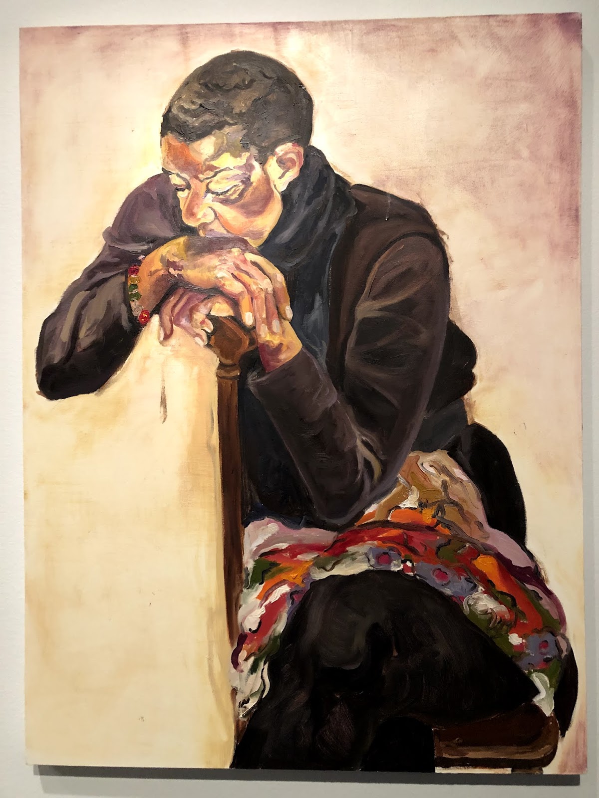
These first two paintings are, if I remember correctly, the only paintings with the subject not looking straight at you. She has a strong sense of composition and graphic quality to her work.
Jordon's Mother, a tender portrait
another moving scene
There is a room in the exhibit where she is wanting to show the vulnerability of the black man who are often portrayed as violent criminals. Instead they are all naked and posed in rooms and poses of their own choosing. This is an example of the tenderness with which she treats them.

And then, returning the gaze...
Have to love the red slippers!

Wednesday, October 24, 2018

Laguna Beach Art Association Part 2

So. Last week I showed only one known artist to me and spent the time on the art and artists that were new discoveries. Then today a friend of mine sent an article on the healing properties of going to see art as an aid to healing! The title was "Take Two Emily Carr's And Call Me in the Morning." It is in fact being implemented in a certain place that will be revealed in another post. But, don't you just love it? It made my day.

First up today is William Wendt. I found out at this exhibit that he was a deeply religious man and he endeavored to do God's creation justice. I do think he succeeded as I always think of him as an amazing landscape painter.
These are not all stellar photos as sometimes the glare just could not be avoided. And I did not take photos of all the name tags. But my memory of who is who is pretty good.
William Wendt, The Mantle of Spring
His landscapes are always memorable to me. Rich in color, texture and composition. So much movement.
William Wendt
Laguna Beach. Gives you such a sense of place.
William Wendt

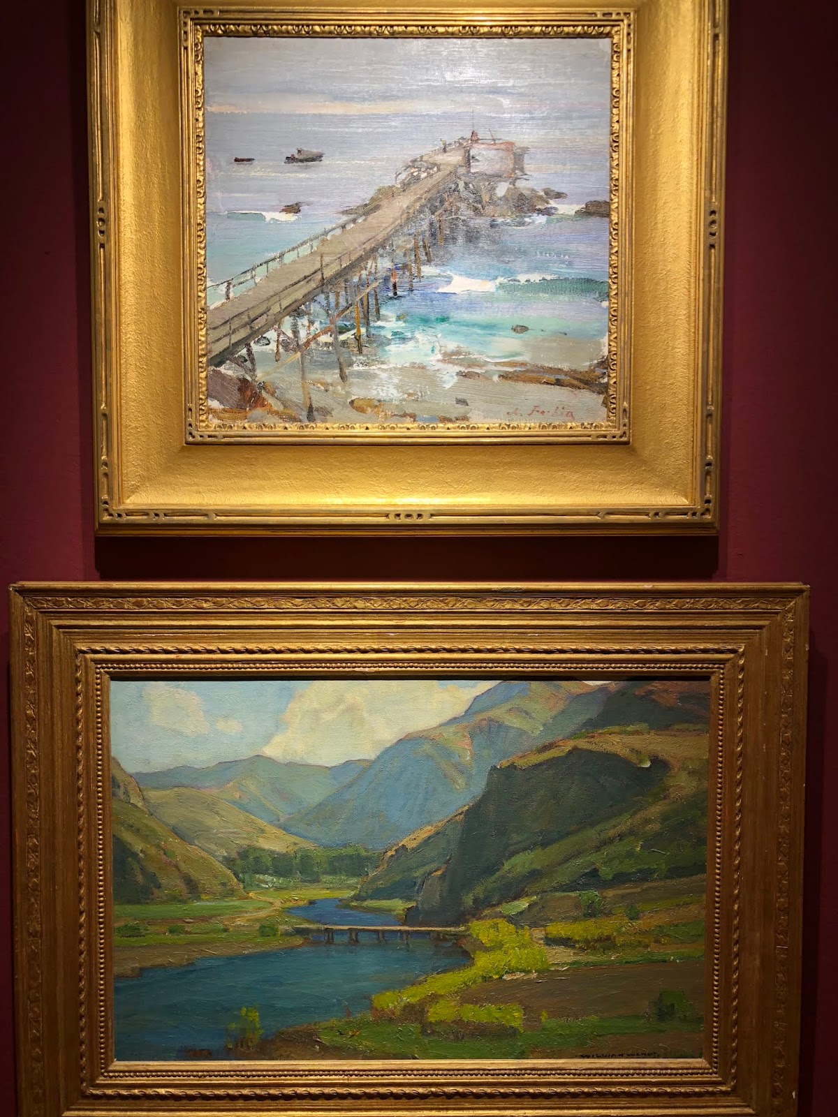
Below is one final photo I took of his and it was grouped with Nicolai Fechin. If that isn't high praise I don't know what is! I don't know that I have ever seen a Fechin 'seascape' before. He was a Russian Immigrant who came to the US around 1923. After living in NY for a few years he went to Taos where he painted the Taos Indians. I know him more as a portrait painter or painter of people more like. It is not known when he went to La Jolla exactly but around 1925 the tag said. A worthy artist to look into.
Nicolai Fechin top, Old Pier; William Wendt below
I did not get this artists name, but the painting below stood out in its overall simplicity yet boldness of use of Thalo blue green. This color is very strong and in the wrong hands can be overwhelming, but I was quite taken my how well he managed it.

Then there is Joseph Kleitsch, whom I have written of before. I went to the now closed Pasadena Museum of Art to see a whole exhibit on Joseph a year and a half ago. This was the last painting in this current exhibit and a fitting way to end a great show. On a lazy afternoon, strumming a guitar while a faithful companion sits patiently waiting.
Joseph Kleitsch
This is just a small taste of well put together group of artists that painted in and around Southern California 100 years ago. I once again urge anyone who is in the area to make the effort to see this exhibit that is up through January 13, 2019 at the Laguna Art Museum. Be prepared to feel a part of another time and place but in the company of some masterful artists. We are so blessed!


Friday, October 19, 2018

The Laguna Beach Art Association Exhibit

Last week I flew to SoCal. One reason was to see the Laguna Beach Art Association Exhibit at the Laguna Art Museum. Edgar Payne was one of the main founders of this art association which started in 1919. Here is a painting by Edgar Payne hanging in the exhibit. There was also a magnificent large painting from the Sierra Nevada's.
Here is my most favorite "new" artist for me. I had never heard of George Brandriff before but these two paintings are both by him and I love them for different reasons. The top one has such an amazing composition as well as being very luscious in paint application. The second one I thought had particularly well done abstracted shapes that made up the whole.

detail of the abstract handling of this painting, Sunday Reflection, 1929

Here is another new to me painter, Frank Cuprien. This painting that at first I did not really like. It took some getting used to. It comes off as so Yellow. But the longer I looked at it or tried to ignore it (both) the darn thing kept calling me back for closer inspection. And upon further reflection it too made me marvel. The foreground water is a light wash over a wonderful palette of soft pastel under-layment which is thicker in texture. I learned that Frank built a house on a hill overlooking the ocean and was known for just painting water. This painting is from 1930.

Detail from Poeme du Soir, Frank Caprien
Thomas Hunt, Newport Harbor Scene
I like this Thomas Hunt, another artist I had not heard of before, Newport Harbor Scene, as it is so graphic and simple. With the blue flag hanging down out of the top frame. Very 'edgy.' There was one other by him, also boats, although more abstract than this one.

I did not take a photo of the tag for the painting below so I do not have that information to share with you. I guess you will have to go see the show if you want to find out! It is up through early January I believe. And it is well worth a visit if you are in the area. I really enjoyed the exhibit very much. I took the photo because I liked the abstract shapes of the porch and laundry and the colors used (a wee bit of glare there). I also thought the palm tree rather lovely with the warm browns in there. Not something you see painted in on palm trees too often.


To round out this first post on this exhibition of newly discovered painters for Victoria,  I will close with Ruth Peabody. I think her style is more reminiscent of the time period in which she painted but I did like her work.
Ruth Peabody, The Cookbook
I found out about this show through American Art Review a wonderful magazine that highlights shows around the USA every two months. I find a show that interests me and then figure out if I can go. My sister moved to just north of LA last year so it was a perfect marriage to go see her and her new home and go see this show.

Friday, March 2, 2018

Degas at Denver Art Museum

Monday I met a friend at the Denver Art Museum to see the Degas show. I had heard already from others who had already been to see it that it wasn't that great in their opinions. I went with an open mind, because often times, the artist has a different takeaway than they average person, but I did respect both of these people's opinions. One studied art history in college and the  other works as a volunteer at DAM.
Both me and the friend I went with had the same assessment, though. As artists, we felt that if this was our work, we would not want it on public display! It was like an attempt to show 'unseen' work of a master, as in scrapping the bottom of the barrel. That is not to say there weren't some good pieces by Degas in this show. But it is an extensive exhibit which meant going through a lot of chaff to get to the wheat.
Here is one that looked great from across the room. The graphic shapes and abstract quality were what drew me into it. However, it wasn't something you thought attractive up close. The woman's face on the right especially her nose and right eye were a sickly gray and even in this photo I think it shows up as a bit weird. The painting below it is one of the few in the show of his more recognizable ballerina paintings.


In the following pieces are the two of horses that were worth noting. I liked the top one for the same reasons I liked the three women above. The simple shapes and the abstract quality of the composition.

This second one is more a typical finished racing painting.
This is probably my favorite: very simple but a great composition. Nothing more needs to be said.

This exhibit is on view through May 20, 2018

Tuesday, January 9, 2018

Klimt at the Legion of Honor

Lady with Feathered Hat
The show at the Legion of Honor in San Francisco is a double billing of Klimt/Rodin. For me, it was all about Klimt. Don't get me wrong, I like Rodin's work, but I came to discover and see Klimt's paintings in person. This painting of the Lady with Feathered Hat struck me because it brought to mind one  of Klimt's proteges,  Egon Schiele, whom I happen to really like, more so than what I would think of a typically Klimt piece. But this exhibit was not a show of what most people have in mind when they think of his work. A few pieces, of course, but not overall.

For instance, one usually thinks of females, especially the Kiss or the Woman in Gold. There was one piece that fit that mold, The Maiden, shown below. I took this long view of it to show its size. Klimt painted LARGE! But the size adds to the power of his images. I think there are at least 6 women in this painting, with the virgin in the middle of this menagerie.


My personal favorite works of Gustav are the landscapes. Most people have no idea that he painted landscapes. It said in the exhibit he fit them in around his commissions, but tended to do 3 or 4 per year. They are also quite large, and all of them are square. Below is one of the 4 that were on display. It is of the Schloss were he went for rest and recuperation. You can see the lake to the left where he boated. I took a close up of another painting so you can see the brush work. I was quite surprised to discover how loosely he really painted.


Next up, either Richard Diebenkorn or The Women of Paris from our own Denver Art Museum show...

Thursday, January 4, 2018

A New Year Begins! Welcome 2018

As a follow up to my last post, I will regale you with my take of the museum art shows we went to. To start, my son and I had a time of wonder and discovery together.

Starting with landing in LAX where my sister and her husband picked us up. We drove straight to the Pasadena Museum of California Art as it was 'on the way' home. The exhibit of E. Carlton Fortune was everything and more I could have hoped for. Photos were not allowed, unfortunately, so I did buy the catalog. I have not been impressed with exhibit catalogs of late so it is rare I will buy them.

The show started chronologically, but the first one that took my full attention was of Monterey Bay.
There are many artists who paint the coast, with the rocks, waves and coves, but not always do they take your breath away. Effie's (Effie is what her family and friends called her, but for her professional name she went by Charlton) handling of this subject was pure joy. Despite how many of her paintings I liked and would love to own, this one, for me, was the premier piece. I found this tiny image of The Lonely Shore to post here, but it does not do it justice nor does the image in the catalog.

Even as a thumbnail, I think it still shows it well enough. The colors and the paint application are stunningly luscious and varied.

If my memory serves, the image below is a view Effie painted from the old Santa Barbara Mission which burned down in the 1920's. The second painting below shows that Mission as a sprawling property with a cow grazing.


Charlton moved around quite a bit. She lived and worked all up and down the California coast painting as she went, mostly on site. One reason being, her home burned down in the SF earthquake. Eventually, she and her mother moved to Europe, where again, she moved around quite a bit. They lived and visited relatives in Scotland; they lived in St Ives, and also the south of France. While living in France, she entered the Paris Salon, and 'Mr Charlton Fortune' won an award and critical acclaim. She used her name to her advantage, as well she should!

Needless to say I could go on and on about Effie and this show; The good news is that after it leaves Pasadena in January it is going to the Crocker Museum in Sacramento so there is still plenty of time to pop over to CA to see this amazing painter's work.

Our next museum stop (not counting the Reagan Library, the Hearst Castle and the Monterey Bay Aquarium) was the Legion of Honor in San Francisco where the Klimt/Rodin exhibit is. Stay tuned...


Thursday, December 14, 2017

An Art Expedition!

I am so excited to be flying to California this week despite flying right in the heart of the Thomas fire. It is so sad that California has been hit with so many devastating fires. My sister says the Thomas fire is only 20% contained. It is unfortunately taking the path we were planning on driving so alternative plans will most likely be implemented. ie the interstate vs Hwy 101 along the coast. I so wanted to drive up along the coast, but the fire got there first. We will see where it is on Friday, our expected day to head north.

My son and I are going to see family and art exhibitions. We are flying into LAX; from there we will go directly to the Pasadena Museum of California Art to see The Colorful Spirit: E. Charlton Fortune. I am so excited to see her work. I only found out about her last Spring when I first went to the PMCA. A book in the gift shop of all things. That time there was two great exhibits Joseph Kleitsch and much to my surprise, Gustave Baumann was also there. PMCA does not have its own collection so these are one of kind, borrowed from all over, exhibitions. This time the other two shows look good too. Exciting!

We will stay in Ventura for 2 days where my sister lives. Fortunately in an area that was never evacuated. From Ventura we will rent a car and drive north. We are not sure exactly what we do along the way but our first for sure destination (based on fire...or no fire) will be Monterrey. We have only heard good things about the aquarium there.  From there we will head to San Fransisco. We only have one Museum on our schedule there but it is a big one. Gustave Klimt and Auguste Rodin! I have been to the Rodin Museum in Paris a number of times but I have not seen much Klimt in person, so that is going to be a treat. I hear it has content not suitable for children. I am thinking photos will not be allowed in that case...

Our time in SF is only 2 days, but then we will spend time with family in the area for 2 nights as well. Our last museum stop will be at the Crocker Museum in Sacramento. This will be Richard Diebenkorn's early works. From art school, through being in the Marines and early in his career.  What a fitting end to our road trip. We will fly out from SAC after that. I expect to come back inspired and ready to jump back into my painting.

Thursday, April 27, 2017

Gustave Baumann at the Pasadena Museum of California Art

Gustave Baumann, long a favorite of mine, just 'happened' to have an exhibit at the Pasadena Museum of Art where I had gone to see the Joseph Kleitsch show that I had read about in American Art Review. If you don't subscribe to this magazine (artists in particular) I highly recommend it for learning about not just American Artists, but the history of American Art through our founding. It is a magazine that compiles shows going on all across the US. I have learned so much over the years from this well written magazine. For instance, there was another article in this latest issue on Maynard Dixon and a show in Reno, NV of all places, currently going on. Since we were driving, I had hoped to get to that show as well, but I am grateful that I got to Pasadena, so I knew two stops, out or our way,would be pushing it.

For those who do not know Gustave Baumann's work a brief introduction. He was born (1881-1971) and raised in Germany. His family moved to the USA when he was 10, but he studied art and wood block print making back in Munich, Germany. He settled in Santa Fe, NM in 1918 thinking Taos was too crowded! His color wood block prints from NM are perhaps his best known. He also built marionettes.
Gustave's printing press.
There were a few of his gouache studies included. I had not realized that he did these studies for future block prints. The simple graphic shapes show that he is thinking all the time about how it will work in a block print.
I took this photo of one of his blocks (the finished print is below the tools) to show not only the size but the 'yellow' denoting the color of the block. Good reminder! Some of his prints had, and I am guessing, 8 individual blocks for color per print. I can only image having to register that many blocks on however many prints he was making! I struggled with 4 and my foray into block printing was nowhere near the level he took it to.
The tools of the trade. I liked the turquoise handles...
Gustave did love to do trees. I had not seen the mighty redwood print before. They showed this particular composition in each of its separate colors. I can't remember now if it was 6 or 7.
One of his early works from Germany. Simple, with only a few colors (3?) but I liked it.