Search This Blog

Showing posts with label class work. Show all posts

Wednesday, June 20, 2018

Painting the Figure

Sunday evening as I was preparing dinner a friend called me to tell me that the instructor of a week long figure workshop she had signed up for had just let her it was okay for me to substitute for her the first two days of the workshop. My friend was not able to take the whole week off from work. I offered to fill in for her if she wanted me to keep her abreast of what was going on and take notes for her. I offered because my friend spoke so highly of this instructor and she keeps inviting me to join her in these workshops, so here was an opportunity for me to get a feel for what she was saying. We had spoken about it a few weeks ago so when she called Sunday night I had quite forgotten about the whole thing. And the class started Monday morning.

I was able to make it work into my schedule although this week was not a prime time for me to be taking two full days away. What swayed me to go was the opportunity to paint from a model. I have not done that in years and years. Here is the portrait from Monday.
9x12 head study in oil
The instructor had us do a monochrome portrait in the morning. In the afternoon you could finish the portrait continuing with monochrome (5 values using burnt umber and white) or add temperature. I worked on top of my monochrome portrait adding temperature (not color). You can still see just the value on her collar bones and shoulders where I did not quite finish painting over the morning study. All things considered, I was happy with this portrait. Painting from life is a whole different ballgame. I really enjoyed the exercises. The model had such good bone structure too.

Tuesday we did another head study adding color. I wiped that one off as it was fine but nothing I cared to keep. In the afternoon we were to stay with temperature and value alone or add color. I added color. Her skin was so fun to paint. I would have like to have been able to 'finish' this piece but I was happy enough with it as is, until I dropped it on my garage floor face down when I was unloading the car. I had not photographed it yet, so here it is dried grass and all.
12x16 figure study in oil
An artist friend I had seen at the Summer Art Market a few weeks ago invited me to join her at the Arts Students League of Denver to paint long pose uninstructed. This little exercise was just the thing to get me to want to go to just paint from life and be among other artists.


Friday, December 9, 2016

Bad Advice?


One of the worst things I think I was ever told when learning to paint by an instructor was to "stop resting on my laurels" and learn to paint. He was referring to the fact that I liked to paint in big bold simplified shapes. Every week he would say what was good about what I was doing and why it worked, but then would tell me now I needed to learn 'to paint' and not be so stylized as obviously that was easy for me. And boy, was it hard to break myself of this viewpoint. 

It was my first formal class in oil painting, which I took at the Arts Student League of Denver when it was located in Lodo on Larimer Street. He started us out in black and white only, then to gray and then moved on to adding one color at a time. Here are two color examples I came across recently, and I still like them! Painted on gessoed cardboard, you can see where the top example was punctured. Being that these are now 30 plus years old, they have held up remarkably well, don't you think? I think they were painted in acrylics, not oils, though.

I had recently seen an artist friend post her new paintings on Instagram and they reminded me so much of my own work way back when. I really like what she is doing. I still paint in bold simplified shapes, but in a more 'painterly' and 'refined' way. A part of me is wanting to go back to the day and revisit flat color. Play around a bit. Simplify and exaggerate.

Monday, August 17, 2015

Janice Nowinski Workshop Day 2 and 3

Day Two: I decided to start a new painting and leave the boats for now. I was a bit confused by the end of day one so I brought in a larger board and decided to go graphic with big simple shapes. I used a photo of my son since figures seemed to be the modus operandi. It is a photo I had taken to be part of a series I had started on reading years ago but had been distracted from completing. I started this series before the iPhone came on the scene but I have kept those photo references in an envelope as I add to it in case I revisit that series. NOTE: an ironic addendum to this. In yesterday's WSJ was an article on the decline of summer reading from its apex after WWII. The link to this article by Lee Siegel is not available but when I did a search I see that this is a recurring theme of his. I realized I had read other of his articles on this topic on the decline of reading books.
After quickly blocking the shapes in on this very slick surface I was ready to correct the relationships and start painting. It was suggested that I leave it as is. So I did. After looking at it awhile I think I did not have the right proportion board in relation to the photograph. My math is off, in other words. That is one reason I think the hands are so large. I can't find the photo to verify this.
I think this piece has potential. It was well received as is and deemed complete by the class and by Janice. Not sure I agree. You can judge for yourselves. What I may end up doing is starting a new one instead of my normal reaction to over painting the original. That is something Janice suggested that is starting to make sense to me. So there is a takeaway from the workshop.
Reading On a Jet Plane, 20x16, oil on slick board, 20x16
When I took these pieces to work one of my coworkers really liked this painting as well. Another coworker asked why I was taking a workshop and not giving one? Good question...Amazingly enough I had an email yesterday asking me to go to WI to give a workshop. I'm thinking on it.

Day Three:Another figure. I wanted to see what I would do with editing an image and not being so *literal in its translation. I left out quite a bit from the photo reference and am quite happy with this one. No one recognized it as the wall sculpture outside the Denver Art Museum. I don't think you are supposed to climb it but one day where I was meeting a friend, someone did!
Here are some photos from the critique at the end of the third day:
All three of these paintings were done from black andwhite photos. Nicely done, too.

Sampling of works completed during the workshop.

More critique...love the translation of Matisse.
*Note: "literal" became one of the hot button words of the workshop-not sure we all agreed on what that word means. I had to define the term "graphic" more than once when I used it to describe my work. Another interesting topic for another post. How we think we can redefine words to fit our own definition.

Thursday, January 1, 2015

In Her Father's Footsteps

In her Father's Footsteps or Budding Artist, 24x18, oil on panel

Happy New Year! A great year has ended and I am excited by what 2015 will reveal. 

You may remember this painting from a post a month ago when it was painted as dark/light pattern. I have since moved it into local tone. So three values as opposed to two. It did not take much to do that and I like it better. Mainly the wall is a darker value so it does not blend in with the paper white edge of the painting on the wall. It helps to carve out her apron more as well. The rug is darker so now the paper towels on the floor read as another value. A bit lighter values are also on the stool and taboret and called it done!

I have signed up  to do 30 paintings in 30 days starting today! It is highly unlikely I will do 30 paintings in 30 days but I figure the chances are better if I sign up for it than if I don't. Even if I get half done I will consider it a success. I will be posting the paintings here and on the blog where over 800 artists from around the world will also be posting.  See you soon!

Monday, September 15, 2014

Texture and Paint Quality - painting without a brush

Anyway you turn it...it looks interesting...and reads well

oil on linen panel, 11x14, Abstraction
Here is an exercise in paint quality. What is meant by that is the texture of the paint applied. I have had a tendency to paint fairly thin over the years. I have been working on a more painterly approach the past year or so but this exercise was helpful as it took me out of my comfort zone in not using a brush. One does get attached to painting with a brush! The tools used to apply paint to canvas were: a credit card, a putty knife, oil sticks and a plastic tool used in printmaking. I had some old paint on my palette that was not quite dry but had started to dry and I used that in places (notice the "white block toward the center) with those flat edges to get some interesting textures.

Painting a "non-subject" does not come easily to me but I did find this freeing in a way. It is also harder in that there is no subject to rely on. I had to think of varying the shapes, the colors and the values to make something pleasing and interesting. I was quite stunned when my husband asked to see it and then said he liked it and liked it whichever way I turned it. Now that is high praise! My daughter also likes it and the two images above are her preferred directions.

In case you are curious, the original way this was painted is below...my husband wants me to frame it but I can't decide which direction. I am open to suggestions. Let's go with 1, 2 or 3 in the order they are posted.Thanks!

Sunday, May 25, 2014

Fritz the Schnoodle

Day 1: 20x16, oil on panel (photo taken with iPad under florescent lighting)
I am working diligently to be more aware of paint quality. By that I mean having the brushstrokes be visible. I have always tended to paint smooth when in the studio. I can be very expressive outside painting but that does not necessarily come inside with me. I thought my dog, Fritz, would be a good subject to practice "paint quality" on. He just lends himself to it. I got him pretty well blocked in on the first day, shown above. There are definitely things that need to be corrected and finished, but his personality is already coming through.
Day 2: photo taken with iPad under florescent lighting
Not as much progress as I had expected was made on day two. I did get the whole canvas covered finally. I moved his left eye over a bit but I am not sure it doesn't need to moved closer in. I worked on his face, chest and front legs but they are still not quite finished. The background and rugs got more detail and refinement as I worked my way around the composition trying not to stay too long in any one place. The box in the background is coming to far forward and I hope it is just reflecting glare from wet paint. It was one of the last things I did, but if it is not the wet paint, it has to be toned way down to be pushed into the dark recesses of our kitchen.
Day 3: 20x16, Fritz, oil on panel
Day three has Fritz looking like the sassy boots he is. I did move the eye on the left further to the right; I did work on pushing the background further back as well as the depth of the rug he is standing on as it recedes and finally, some fine tuning on Fritz including adding his tags and melding some of his fur a bit better. I also had to bring his front paws over the threshold as it just wasn't reading correctly with them stuck below that level.

Friday, December 13, 2013

Three Value Study

9x12, oil on panel
In preparation for doing a local tone painting, I did this study using three value groups. To do this you can have variety of color but only one light value, one medium value and one dark value. So my dark value is the black and the browns.There is a little glare on this painting so some of the darks don't look as dark as they are. The medium group is the largest group and it is the grass and the barn itself. I used yellow green at the top left side of the hill down to a blue green where it hits the fence, but it is all in one value if you squint down. On the barn, to keep it from feeling too flat, I add blues to gray the reds down on the "shadow" side, yet kept it in the same value as the front, which is a richer red. The light group would be the sky and the roof and the sheep in the field. The roof is a greener gray and the texture I used also helps to differentiate it from the sky, which has more blue in it. But again, if you squint you will see how they merge into one value. This was a fun exercise and has me primed for the next painting, which will be local tone. Stay tuned.

Gray-scale showing three value groups, light, medium and dark
This barn was a "drive by" as I was traveling with my aunt through North Carolina. We were leaving the Smokey Mountains and starting to head East towards Raleigh//Durham. The road was amazingly narrow, rolling and curvy. Luckily, I was not driving at the time so I was able to hang my head out of the window trying to snap some photos as we whizzed by.

Friday, October 18, 2013

The Start of A Rainy Day in Paris


Dark/light pattern is the visual approach that I will document progress on over the next several weeks. I started this painting just blocking in the dark pattern which is the large shape. I did several sketches beforehand trying to figure out some areas where I was not sure if I wanted it to be part of the light group or the dark group. I still have a few small areas where I will decide which pattern they will go into as I get further along for better eye flow. The story will be told in the dark group/pattern for this painting. That means I will be putting more information or detail and color shifts in that big shape and the light group will be very simple. I don’t often paint this visual approach, but it is very striking when it is successfully done.
 name TBD, Oil on Linen, 30"x20"
In this first block in above, I was testing the red of the bus and umbrella as part of the dark group where I had put it in my sketch as that was my inclination and it seems a good fit. The part that made me unsure is the red bus being dark and the windows of the bus being dark. I decided to break that large bus shape up by using a light rim around the windows and adding light text to the side of the bus.

In the next phase, color has been added still keeping the value of the color in the dark or light group. You can see between the two images how I am doing that by distinguishing the shapes or pulling the smaller shapes out of the larger overall dark pattern, yet keeping them in that pattern. The pale yellow of the buildings in teh background still read as part of the light group.

It helps me to see these side by side as I "see" things that I lost to one group or another that I am not sure I want to do. If you can spot those areas, let me know...as you may see something different from me that I should pay attention to!

Friday, April 19, 2013

Progression of Aspen Meadow in Fall-Work in Progress

Week 1 Block in
The initial block in went well. The patterns and eye flow I was wanting were pretty much there. All in all I was happy with the start of this painting. The reference photo I am using for this is from Golden Gate State Park, the meadow between two trails, mid-September of last year.
Week 2 correcting drawing from block in
Week two I realized how slender the pine tree was on the left so doubled it in width and with that had to move the two aspens on the right over as well. I added a tilt to the right as I had made it too straight up and down. Also corrected the angle of the aspen coming from behind the pine tree. Then I started on getting the values corrected. It is noonish on a bright sunny day so the grasses and other flora had to be lightened up as they are getting the most direct sun. I used some leftover light blue from my palette to redo the sky holes but know it was not going to need to be lighter at some point.
Week 3 refining


It is good to see the progress made over three weeks. I see some things in week 3 that I like but I also see somethings that I have lost since the original block in that I want to bring back.One of those is the lovely arrow movement of the meadow behind all the aspens. Stay tuned for the next step. Week 4 is critique.

Saturday, March 16, 2013

Color as a Visual Approach in blue

Along the Adriatic, 24x24 oil on board
As I wrote last week, this project is Color as a Visual Approach. I chose an easy one to do in blues, since most of it already tended toward blue if it wasn't outright, like the sky and the sea. The only thing I really had to work at was the sand and the woman's face in the sunlight. It is reading as sand, but that sand actually has a lot of blue in it, making it a greenish color. See patch below and how green it looks on its own. BUT next to all the other blues, it still reads as sandy colored. Her face is basically the same pasty green but it reads as if it is in the light. This has been a good exercise for me. Even though the sand in the shadow has a lot of oranges and greens, the over color is blue if you squint down. That is the key. To use your whole palette and still keep the over color bluish.
Kevin critiqued this at the end of Monday's class. He likes it but said two things need to be done. The tire tracks on the right hand side are too soft and need a bit more graphic quality to them to match the overall graphic feel of the piece and to tie the shapes in the sand to the bicycle.

Saturday, February 16, 2013

Light and Shadow as a visual approach

What once was Greenland, CO, oil on linen, 20x30

We are done with this month's visual approach and I have yet to write a post on it. Light and Shadow is pretty self-explanatory; where there is light, there is a shadow. Simple, right? Not so much. This approach does use elements we have touched on previously, which makes it that much more challenging. How to incorporate them all into this visual approach? First think dark/light pattern. It is a good thing when starting a light and shadow painting to think of the large dark shape vs the light shape, what kind of pattern does it create? Then you must decide if you are going to tell the story in the light or in the shadow. One of them will dominate or have more detail and break down of shapes and color and the other will  be simplified. This is where you can spot a painter unclear of the concept and I made this error for a long time. ie Putting the same amount of detail in both the light and the shadow.

So, you lay out your composition with the dark/light pattern, then what? Add your middle value; There is a half-tone or the bridge between the light and the shadow. This is where Local Tone enters (remember, local tone has three values, light, medium and dark)The thing that keeps Light and Shadow separate from Local Tone is that local tone is flat; light and shadow has more form as you have the light source and highlights. When adding the light source you have to decide if the light is cool or warm. If it is a warm light on a sunny day, the shadows will be cool. If the light is cool, the shadows will be warm.You must also determine the direction of the light source; is it front lit, top lit, back lit, or lit from below or coming in at an angle. The light will hit the planes of the objects in a pattern and similar plane shifts will have similar values of light hitting them.

Kevin painted on my project because I wanted a demonstration of using gradation in my sky. Gradation is also an element of Light and Shadow. From right to left it was to be warm color moving to cool, and from light to dark; then from the top to bottom, dark to light and cool to warm. I can do one direction of the other but was not quite sure how to do both directions at once. I did give it a college try but was not satisfied with the results. His version of my sky, in the photo above is very gradual, and truthfully, I really only see the top down gradation and not so much the right to left. But be that as it may, it was helpful to me to see how he approached it.

I am still not finished with this painting and I missed the critique. There are lots of dried grasses coming through the snow that will add a nice contrast to the blue sky and snow, as well as give an overall warmth to the scene. As you can see, lots to think about when working with light and shadow, but it becomes second nature once you get all these things working together.


Sunday, July 24, 2011

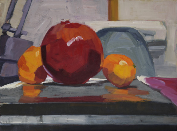
The Big Picture

6x8" oil
The last assignment for the Master Painting class I took a few years ago was to do a small "study" of anything we wanted and to then paint a larger piece (minimum size 18x24) using only the small study for reference. Trying to copy even the brushstrokes! This was to teach us how hard it is to make a larger painting look good even if the study works well. Our end of the year assignment fell in December and so I had brought up these fruit from the kitchen and just set them down while I decided what to do. Serendipity had a hand in it as the fruit set themselves up! I painted this at eye level using a kneeling bench. That is my old printer behind the nice gray shape of my desk chair and the base of my lamp to the left. I can't remember what adds the nice white line to break up the grays. I still love this little study which hangs above my desk.
The Big Picture, 18x24" oil on board
The larger piece was not so successful. I happened across it while looking at old paintings stashed in the basement and brought it up to see if I could make it work. Kevin saw it in my studio when he came over last month and he pulled it out. He always liked my study for this assignment so he gave me a few things to do, saying the larger piece was just about "there" and it was worth saving. I did as he suggested, but I have not yet been told it is "there." "Here" it is.
Ah, I wrote the above text before I had the photo uploaded from my camera. Somehow seeing them online makes the differences "jump out" at me. If I really want them to match, I suppose I shall take it back to the easel. 

Tuesday, June 14, 2011

Color Charts - a personal choice

Grayed Oranges to Bright Oranges
A few weeks ago I mentioned that I would be writing on the "new" way of looking at color via color charts. This post may not be for everyone, but it is an important topic for me. I have completed 16 out of the 50  exercises in the book but I am getting the gist of what is being brought to bear on how to see color so that you can mix what you want at anytime. I did my last set of color charts the "normally accepted" way 3 years ago, and except for those color mixes I often use I still must consult my charts! I feel so tied to them to make a color choice. I was wondering why it was so hard to "get it" and now I have a glimmer of understanding.

The theory behind this book is that we have all been taught to look at color incorrectly. The author believes there is no "color wheel" as such as there is no true red, true blue or pure yellow from which all other colors are made.  Basing his theory on light through a prism, a red is either a red-orange or a red-violet as it comes; Blue would be blue-green or blue-violet and yellow would be green-yellow or orange-yellow. 

The charts are also laid out differently than the color charts I have done previously. The chart above is using 2 of the 6 colors from the prism, pure color on each end, and mixing them together in various %'s. Adding white as you go down the column (so 10 squares across by 3 down). As you can tell, I was not careful about keeping the values the same, just so I had an idea.

Example above: Exercise 10 Grayed Oranges: I took green-yellow (for me that was Cad Yellow Lemon) and violet-red (Quinacridone Violet) Because there is no similar color in either of these colors, they gray each other out. Based on the prism/light theory, to get a bright orange (Exercise 13) you would use an Orange-Yellow mixed with and Orange-Red to get the brightest Orange (see where both colors have "orange" in their name). The author uses Cadmium Yellow Light for his Orange-Yellow and you can see I had a hard time getting 8 different colors mixing my very orange-yellow with the very orange-red.

Exercise 11 Mid-Orange- "Brassy:" Orange-yellow (cad yellow medium) mixed it with the violet-red (Quinacridone Violet)

Exercise 12 Mid-Orange-"Soft/Warm" Green-Yellow mixed with Orange-Red

The book I am reading will remain nameless as there is so much personal preference out there and bias on color and how
to mix it. I think it has been good for me and that is what counts.

Monday, December 13, 2010

White on Black Exercise-"Cracked Pot"

On Friday I used this little still life to transition from my work week to my weekend of painting using a white object against a black backdrop. Not only do you get to see the variety of colors within black, but how the white object interact with the blacks. I saw both warm and cool colors in the enamel. I had natural light coming in from a north window. The surface was a painted wood table and then there was a warm wood door in shadow as the backdrop which I chose to put in as a solid surface. I had found this coffee pot in an alley and the bottom is so badly burnt that it is rounded and all the enamel has cracked off. Who knows what happened to whatever was in the top - but I use it as a vase. Just a fun little painting that is 12x9.

Monday, November 8, 2010

Black and White


The last two Saturdays I attended Kevin Weckbach’s class. Oct 30 was the critique for the month’s homework assignment. I had not been in town to attend the class at the beginning of the month so I had to glean what I could out of the email that was sent with the assignment. I misread it, so I did the following still life thinking it was a use of “mother” color and that mother color was BLACK (ie every color I put on the canvas should include black in the mix, even if the “color” being applied is white). Instead it was supposed to be a still life of “Black on Black.” To do this I should have had a black backdrop and all the objects should have been black. The Reflective objects I used where fine as well, since they would have reflected all the black around them to make them appear “black.” I failed in that I did not do the assignment correctly, but I passed in that I did the project correctly based on my criteria. I also timed myself so this was a very quick painting. I gave myself 1.5 hours to do a 14”x18” canvas. I cropped out a roll of blue paper towels as they just didn't add anything to the composition.


November 6 we painted in class doing “White on White.” The same concept using all white objects, back drop and table top. It is 11x14 and it took me the whole class time to do it. (10 am-1pm) We did not get to a critique but Kevin said I was getting it. The point of these exercises is to pay attention to the color variations within a color grouping, ie there are warm whites and cool whites and what reflects into or bounces off of each surface also impacts the color.(that is a billy goat's horn (hollow) on the right-not really a white but we got away with it.)