Search This Blog

Friday, November 29, 2013

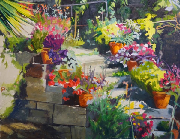
Staircase to the serre des cactées au Jardin des Plantes (Paris)

Floral Staircase Block in, 24x30, oil on board
We are still in Paris for this next exercise. This painting has the visual approach of "equalization" which is being used as an element here. ie, each potted plant has a pattern within it that is relatively equal in size and shape. This top photo seems a bit garish, especially compared to the bottom one but I was using bright colors to block in. The truth is somewhere between the top painting and its exaggerated (but not overly) color and the more washed out look of the second photo. 
Day 2
That being said, I really am finding out just how tedious "equalization" can be. I am attempting to not get too caught up in details, but even so, Lots of small flowers are involved here! In the block in I was attempting to get larger blocks of color as placement and flow, and the overall dark light/pattern of the sunlight and shadows.
The next day I started paying more attention to the actual patterns in each potted plant. I want them to be distinguished one from the other . One of my pet peeves as a gardener is to see paintings of flowers where you really cannot tell what they are. I don't need it to be perfect, but plants have their own personality and structure. I do want people who know flowers to at least have an idea of what the plants are, not just that they are plants.  The next post will show more fine tuning. It is good for me to document progress as a photo shows me things that I may not have noticed until I photograph it. Just as an example, the top "step" looks canted as the little step is not defined enough by the strip of nondescript greenery. I have since fixed that but it had not jumped out at me prior to taking the photo. Stay tuned for the next step in the process.

Monday, November 25, 2013

A Rainy Day in Paris - where is it?

A Rainy Day in Paris, 30x20, oil on linen
Here is the completed painting as a dark/light pattern. The dark/light pattern is considered the visual approach. Just to refresh, that means that there is two values and every value must either tie itself to the light group or the dark group. This painting has the pattern in the dark group. So, technically if this were more "true to life" there would be a third value, in the middle. For example, the buildings behind the umbrellas would be much grayer and more one overall middle value. As they stand now, I lightened the buildings themselves so they would tie into the light group and in that carve out the darker umbrellas;  and darkened the roofs o they would be part of the dark pattern. In the clothes, especially the green rain coat, there would be more reflected light from the areas that are so wet, but I kept the overall value of the jacket so it "reads" as more one value and not obviously separated by light and dark.

I put off posting this painting because I kept thinking I would go back into it and add the middle value, but I just like it as it is, so finally decided to leave it alone, at least for now. What I may do instead of messing with this one, is redo it as a local tone. I really enjoyed the challenge of this exercise. I do not normally paint in two values, but it really does make a bold statement. The reactions to this painting so far have been overwhelming positive.

This view is taken from a brasserie right across from the department store La Samaritaine in Paris. The bridge closest to us across the way is Pont Neuf. We had a great breakfast there that Sunday morning. We had attended early Mass at Notre Dame, gone to the bird market after that, then we were on our way, walking in the rain, to the Louvre. I believe this place was called Richard's. Here is our breakfast. I still remember it as being one of the best in recent memory. Fresh eggs, toasted baguette, fresh squeezed orange juice and wonderful cafe au lait. Yum. Perfect for brunch on a chilly rainy day in Paris! And yes, I ate all three eggs!

Saturday, November 2, 2013

A Walk in the Park - Winter; is it finished yet??

24x18, oil on panel
Over the past several months I have been reworking or finishing up paintings instead of starting too many new works. Because I have become more critical of what I deem "finished" I have not really posted many of them yet. Here is a painting I posted in January and February of this year while it was in progress; Wow, it has really come a long way. It was one of those paintings that I was just never quite satisfied with. One of my friends had written me a very in-depth critique of this after I posted it in February, and she was so spot on. It just took me awhile to get it all formulated in my head and then down in paint. I basically reworked the whole darn thing. It is heading to The Framed Image for their "All that Glitters" show coming up the first Tuesday of November. Hope you can stop by. 

Saturday, October 26, 2013

Rainy Day in Paris continued


This is the stage of the painting that I really enjoy. Bringing my idea to life!
In this photo you can see where I have started to bring in color to break up the shapes that I had initially blocked in. The shapes are holding together with the color added yet still maintaining the correct value to stay as part of the overall dark pattern. Within each of the figures I am keeping the color value very close and not putting in too much definition or form, but just enough to be read clearly as jacket vs jeans vs shoes and enough value shift to still see form. Where as in my block in they were all one value and color.

The next step will be to finish the trees, the roof overhang and bring in the sky and wet pavement. The plan at this point is to start lighter at the top of the sky and introduce a gradation to be darker at the bottom.

A good thing to remember is that every painting started this way (with a dominant big shape) holds together better all the way through the process of painting no matter what the subject or visual approach. I still remember watching Daniel Sprick do a demo a few years ago. He blocked in the big shape of his still life with a dark neutral color and then started to break that big shape into smaller shapes, and within a very short time, it came to life. No initial drawing or worrying about each object. Doing this painting has reminded me of that. Such a fundamental building block yet so few people I know do it, myself included.

Friday, October 18, 2013

The Start of A Rainy Day in Paris


Dark/light pattern is the visual approach that I will document progress on over the next several weeks. I started this painting just blocking in the dark pattern which is the large shape. I did several sketches beforehand trying to figure out some areas where I was not sure if I wanted it to be part of the light group or the dark group. I still have a few small areas where I will decide which pattern they will go into as I get further along for better eye flow. The story will be told in the dark group/pattern for this painting. That means I will be putting more information or detail and color shifts in that big shape and the light group will be very simple. I don’t often paint this visual approach, but it is very striking when it is successfully done.
 name TBD, Oil on Linen, 30"x20"
In this first block in above, I was testing the red of the bus and umbrella as part of the dark group where I had put it in my sketch as that was my inclination and it seems a good fit. The part that made me unsure is the red bus being dark and the windows of the bus being dark. I decided to break that large bus shape up by using a light rim around the windows and adding light text to the side of the bus.

In the next phase, color has been added still keeping the value of the color in the dark or light group. You can see between the two images how I am doing that by distinguishing the shapes or pulling the smaller shapes out of the larger overall dark pattern, yet keeping them in that pattern. The pale yellow of the buildings in teh background still read as part of the light group.

It helps me to see these side by side as I "see" things that I lost to one group or another that I am not sure I want to do. If you can spot those areas, let me know...as you may see something different from me that I should pay attention to!

Thursday, September 26, 2013

Notes to self: Richard Diebenkorn

When I wrote my last post, which was on going to the Richard Diebenkorn exhibit at the deYoung Museum in San Francisco, I forgot what was posted as you first walked into the show. And that was his notes to himself. They had gotten lost in the depths of my purse and just resurfaced yesterday. Here they are:

Notes to myself on beginning a painting:
1. Attempt what is not certain. Certainty may or may not come later. It may then be a valuable
delusion.
2. The pretty, initial position which falls short of completeness is not to be valued-except as a
stimulus for further moves.
3. Do search. But in order to find other than what is searched for.
4. Use and respond to the initial fresh qualities but consider them absolutely expendable.
5. Don’t “discover” a subject – of any kind.
6. Somehow don’t be bored – but if you must, use it in action. Use its destructive potential.
7. Mistakes can’t be erased but they move you from your present position.
8. Keep thinking about Pollyanna.
9. Tolerate chaos.
10. Be careful only in a perverse way.
Sink, Richard Diebenkorn
To break up the quotes, I scanned this photo from the book on the Berkley Years exhibit. "the sink" that both my husband and I thought marvelous and which I referenced in that last post as not being available online. You all may think us crazy, as after all, it is not even a particularly "pretty" sink, and definitely not fashionable. Probably especially so in 1966 when this was done, but none-the-less, it showed very well in the museum. Three value groups, clearly defined, and what is hard to see here, as in most reproductions the nuances are lost, there is a highlight on the wall to the right. I bought the darn book just to get this. To remind me, Keep it simple sweetheart!

Then there were the quotes on the walls, which I also neglected to share with you and which I thought worthy of writing down at the time. You know the ones, the big letters written on the walls above the displayed paintings. These are not all of them, just some of them. I found these scribbled in a forgotten pocket from our trip.

"Abstract means literally to draw from or separate. In this sense every artist is abstract...a realistic or non-objective approach makes no difference. The result is what counts."

"All paintings start out of a mood, out of a relationship with things or people, out of a complete visual impression."

"I begin to feel that what I was really up to in painting, what I enjoyed almost exclusively, was altering, changing what was before me - by way of subtracting or juxtaposition or superimposition of different ideas."

Most of these I relate to in some way, and if not directly, I hope to at some point.
Saturday, September 21, 2013

Diebenkorn at the de Young Museum, SF

It doesn't seem that long since we were in California, but we have been home a week now. I feel fortunate to have in-laws that live relatively close to San Francisco and who will put us up or is it put up with us? Either way, seeing Richard Diebenkorn's work in person was a real treat. I had only seen images online and in books. Most of my favorite paintings from the book I have were a part of this exhibit. This studio sink has always been one I am drawn to. Next to it in the exhibit was one called just "Sink" that was ink and charcoal on watercolor paper. I cannot find the image online for it, but I thought it a stunning piece. Just three simple values, and it was breathtaking.
Then his little black and white studies are masterly. Just a simple pair of scissors. There were a few examples of where he took the same still life set up and painted it from different angles making a totally different composition. Using just common items, unrelated, and yet uniting them. ie wooden matches, an acorn, a spoon, a pair of closed scissors and a bottle of what looks like liquin. I could not find the images to show this set up but this was just one example of that theme.
 I have always loved this figurative piece, Sleeping Woman, and seeing it in person did nothing to diminish that.

I also discovered another figurative piece that I just loved called Seated Woman; such a simple composition yet very dynamic.
I was glad to see that the Wednesday that we went to see this show the galleries were full. Not too crowded to be uncomfortable, but well attended for mid-morning, mid-week. I was glad that it was not a timed exhibit although it was more than just the cost of the normal museum entrance fee. It showed a good range of his Berkley years, as it is called. The book from the exhibit has substantially more works in it then was in the exhibit, but anymore pieces and it would have been overwhelming.