Search This Blog

Monday, January 13, 2014

Tomales Bay - Local Tone

Tomales Bay, California . 30x30, oil on linen
In my last post, I talked about local tone using just THREE VALUES. This painting is local tone, with three distinct groupings of a light group, medium group and dark group. But there are more than three values. My light group, as is very obvious in this particular painting, is the sky, the sky reflected in the water, the yellow house and boat house and the white roof. They create a wonderful circular pattern in this painting. The mediums are the rest of the houses (blue and red) and the 3 roofs in the center. The dark group includes the trees and the dark gray roof and the corresponding reflections including the darks under the docks to the right. The docks themselves are both light and medium and create their own pattern.

I currently have a number of other LOCAL TONE paintings in various stages of development. Local Tone is, I believe, my favorite visual approach. Stay tuned! But my next big painting will be light and shadow. As Kevin Weckbach likes to say "the foundation for a good light and shadow painting is a solid local tone."

Tomales Bay is in Northern California, or almost directly west of Petaluma.  Every time my husband and I travel to visit his family, we drive to Tomales Bay to get fresh oysters. We then eat oysters for days! Yes, most of them are eaten raw, but the chef will BBQ "some" for those who just can't eat them raw. But oh, my, talk about tasting of the ocean. I do love a good oyster, and Tomales Bay is where we go to get them. I have heard that there is now an outlet from the farm we go to in SF.  The Farm is called Hog Island. I highly recommend it.

Friday, December 13, 2013

Three Value Study

9x12, oil on panel
In preparation for doing a local tone painting, I did this study using three value groups. To do this you can have variety of color but only one light value, one medium value and one dark value. So my dark value is the black and the browns.There is a little glare on this painting so some of the darks don't look as dark as they are. The medium group is the largest group and it is the grass and the barn itself. I used yellow green at the top left side of the hill down to a blue green where it hits the fence, but it is all in one value if you squint down. On the barn, to keep it from feeling too flat, I add blues to gray the reds down on the "shadow" side, yet kept it in the same value as the front, which is a richer red. The light group would be the sky and the roof and the sheep in the field. The roof is a greener gray and the texture I used also helps to differentiate it from the sky, which has more blue in it. But again, if you squint you will see how they merge into one value. This was a fun exercise and has me primed for the next painting, which will be local tone. Stay tuned.

Gray-scale showing three value groups, light, medium and dark
This barn was a "drive by" as I was traveling with my aunt through North Carolina. We were leaving the Smokey Mountains and starting to head East towards Raleigh//Durham. The road was amazingly narrow, rolling and curvy. Luckily, I was not driving at the time so I was able to hang my head out of the window trying to snap some photos as we whizzed by.

Sunday, December 8, 2013

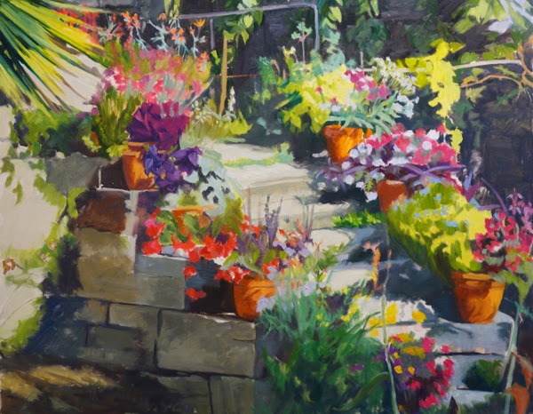
Finished Staircase at the Jardin des Plantes -Name that Painting Opportunity

Still No Name, 24x30, oil on panel
Here is the end product for now. From the last post, I did a lot of tidying up. I started with making the blocks of granite on the shadow side of the staircase darker. I thought that would help contrast with the light. Then I started putting more details into the different plants so that they would be overall more distinct one from the other and also, if you are a gardener, at least you might be able to guess the family. Some plants are more identifiable then others. Since the red begonias are almost dead center and also so very red, I spent some time on that pot. I really wanted the textures to come out so that spindly fine leaves would contrast with thicker leaves and so that you could tell if they were a succulent or not. On the wall in the sun, I toned down the light hitting there so that the wall would not compete with the light on the staircase. I also added more tendrils and the expired plants leaning into the wall area. I am going to let it sit for awhile to see if there is anything more to be done.
If any of you have any bright ideas for a name for this painting, I am open to suggestions. Thanks!

Friday, November 29, 2013

Staircase to the serre des cactées au Jardin des Plantes (Paris)

Floral Staircase Block in, 24x30, oil on board
We are still in Paris for this next exercise. This painting has the visual approach of "equalization" which is being used as an element here. ie, each potted plant has a pattern within it that is relatively equal in size and shape. This top photo seems a bit garish, especially compared to the bottom one but I was using bright colors to block in. The truth is somewhere between the top painting and its exaggerated (but not overly) color and the more washed out look of the second photo. 
Day 2
That being said, I really am finding out just how tedious "equalization" can be. I am attempting to not get too caught up in details, but even so, Lots of small flowers are involved here! In the block in I was attempting to get larger blocks of color as placement and flow, and the overall dark light/pattern of the sunlight and shadows.
The next day I started paying more attention to the actual patterns in each potted plant. I want them to be distinguished one from the other . One of my pet peeves as a gardener is to see paintings of flowers where you really cannot tell what they are. I don't need it to be perfect, but plants have their own personality and structure. I do want people who know flowers to at least have an idea of what the plants are, not just that they are plants.  The next post will show more fine tuning. It is good for me to document progress as a photo shows me things that I may not have noticed until I photograph it. Just as an example, the top "step" looks canted as the little step is not defined enough by the strip of nondescript greenery. I have since fixed that but it had not jumped out at me prior to taking the photo. Stay tuned for the next step in the process.

Monday, November 25, 2013

A Rainy Day in Paris - where is it?

A Rainy Day in Paris, 30x20, oil on linen
Here is the completed painting as a dark/light pattern. The dark/light pattern is considered the visual approach. Just to refresh, that means that there is two values and every value must either tie itself to the light group or the dark group. This painting has the pattern in the dark group. So, technically if this were more "true to life" there would be a third value, in the middle. For example, the buildings behind the umbrellas would be much grayer and more one overall middle value. As they stand now, I lightened the buildings themselves so they would tie into the light group and in that carve out the darker umbrellas;  and darkened the roofs o they would be part of the dark pattern. In the clothes, especially the green rain coat, there would be more reflected light from the areas that are so wet, but I kept the overall value of the jacket so it "reads" as more one value and not obviously separated by light and dark.

I put off posting this painting because I kept thinking I would go back into it and add the middle value, but I just like it as it is, so finally decided to leave it alone, at least for now. What I may do instead of messing with this one, is redo it as a local tone. I really enjoyed the challenge of this exercise. I do not normally paint in two values, but it really does make a bold statement. The reactions to this painting so far have been overwhelming positive.

This view is taken from a brasserie right across from the department store La Samaritaine in Paris. The bridge closest to us across the way is Pont Neuf. We had a great breakfast there that Sunday morning. We had attended early Mass at Notre Dame, gone to the bird market after that, then we were on our way, walking in the rain, to the Louvre. I believe this place was called Richard's. Here is our breakfast. I still remember it as being one of the best in recent memory. Fresh eggs, toasted baguette, fresh squeezed orange juice and wonderful cafe au lait. Yum. Perfect for brunch on a chilly rainy day in Paris! And yes, I ate all three eggs!

Saturday, November 2, 2013

A Walk in the Park - Winter; is it finished yet??

24x18, oil on panel
Over the past several months I have been reworking or finishing up paintings instead of starting too many new works. Because I have become more critical of what I deem "finished" I have not really posted many of them yet. Here is a painting I posted in January and February of this year while it was in progress; Wow, it has really come a long way. It was one of those paintings that I was just never quite satisfied with. One of my friends had written me a very in-depth critique of this after I posted it in February, and she was so spot on. It just took me awhile to get it all formulated in my head and then down in paint. I basically reworked the whole darn thing. It is heading to The Framed Image for their "All that Glitters" show coming up the first Tuesday of November. Hope you can stop by. 

Saturday, October 26, 2013

Rainy Day in Paris continued


This is the stage of the painting that I really enjoy. Bringing my idea to life!
In this photo you can see where I have started to bring in color to break up the shapes that I had initially blocked in. The shapes are holding together with the color added yet still maintaining the correct value to stay as part of the overall dark pattern. Within each of the figures I am keeping the color value very close and not putting in too much definition or form, but just enough to be read clearly as jacket vs jeans vs shoes and enough value shift to still see form. Where as in my block in they were all one value and color.

The next step will be to finish the trees, the roof overhang and bring in the sky and wet pavement. The plan at this point is to start lighter at the top of the sky and introduce a gradation to be darker at the bottom.

A good thing to remember is that every painting started this way (with a dominant big shape) holds together better all the way through the process of painting no matter what the subject or visual approach. I still remember watching Daniel Sprick do a demo a few years ago. He blocked in the big shape of his still life with a dark neutral color and then started to break that big shape into smaller shapes, and within a very short time, it came to life. No initial drawing or worrying about each object. Doing this painting has reminded me of that. Such a fundamental building block yet so few people I know do it, myself included.