Search This Blog

Wednesday, December 26, 2012

At the Wheel Before and After


At the Wheel, 12x16, oil on linen
Here is a painting I did from a slide taken in December 1977! Oh my. My sister is driving my father's VW bug and we are on or way to Erfurt in West Germany. We lived in Zweibruecken at the time.  It is a cold winters day and it looks cold inside the bug as well. I painted the top painting in 2004 in an afternoon and I remember being very proud of myself. This painting was last hanging in my daughter's apartment but when she moved she decided to give it back in exchange for something new. Hey, with a mother as an artist, she can pretty much have revolving art! Well once I got it back in my hot little hands I knew I had to do something about it and it was the perfect project to work on during the holidays when there is so much else going on. As usual, the drawing itself and the proportions were okay. Value relationships and color left a lot to be desired! The first thing I decided to do was to block in the big dark shape and unify them. In other words, I made the upper rim of the door tie into her hat, her hair and her coat and then wrapped it around the molding and steering wheel. I knew that the liner was too light and had to be darker than the snow outside the window. So I lightened the snow outside and darkened the headliner-still not convinced it can't go darker...The red of the metal came next and it obviously was too warm and too light and not enough reflected light on it. Then I went back and cooled down her face which was totally off color. How could she be warm toned in all that cold?? I used some of the color from the snow to make the transition from the light hitting her face to the color of her skin..and got rid of the harsh outline. Her cheek looks natural now. I did very little to her hair from the mass blockin, just very subtle color and value shifts, and tied it into her scarf and hat. The hat I just put in some light to give it form and otherwise left it a solid color. I played a little with the repeating pattern between her scarf and her hat brim. It reads So Much better now.

I still have that hat and get compliments when I wear it. She and I loved to wear our fedora's back then.

Saturday, December 22, 2012

The Secrets of Cezanne Review and how we each define success

A collector of mine sent me a link yesterday of a review he found on a new book on Cezanne. I don't know if the book is any good (although it must be), as I loved the review of it! http://www.the-tls.co.uk/tls/public/article1179756.ece If you have 10 minutes, I highly recommend you read it. It is rather long but fascinating.

I also watched BIG NIGHT last night. I had not heard of it before but a friend of ours has this huge painting he said he had commissioned after he saw the movie. I was curious, as I knew nothing of the movie, but I did find it an intriguing subject and actually ties into the review mentioned above. That subject is "success" and how each of us defines it. BIG NIGHT, if you have not seen it, is about two Italian brothers, in the early 1950's, who came to America to be successful. One brother is an amazing chef, although both brothers cook. They open a restaurant with a top quality menu, yet can garner no business, while the cheesy "Italian" restaurant across the street is always packed. The brothers fight about how to succeed. One wants to compromise so they don't lose the business, and the other can't compromise his "art" for the sake of people who don't know what good food is. In the review on the Cezanne book, it surmises that Emile Zola and Cezanne, life long friends, parted company over their definition of success. That the individuals definition of success pulls artist friends apart much more than failure ever has. I think there is much truth in that.

Wednesday, December 19, 2012

Month 4 - Local Tone

Local tone, to state it simply, is where a painting is "local" color. ie not corrupted by light or shadow. A snowy day, a rainy day or a cloudy day with diffused light coming in. The lack of light flattens the objects down and value is the relationship. There are three values in local tone: Dark, Medium and Light. The medium will be closer to either the light or the dark. In the example below, the sky is the medium and it is tied to the light. Even though this example has shadow in the snow, it is still lighter than the medium and if you squint, the shadow still reads with the large snow shape. In local tone you should have a "base" shape. The base shape below is the dark group or the trees with the house.
In the painting above, the base group is obviously the medium group. The darks are tied to the medium and there is not a lot of dark. Even though there is some modeling of the figure there is no real sense of light or direction the light is coming from.

In the paintings I am doing for this project, the base shape is the medium group. I have started three as I feel ambitious and I like local tone; I will post them as I get them done. Correct me if I am wrong, but do you get tired of seeing the painting progress? ie multiple postings of the painting as it takes shape or would you like me to post as works in progress? 

Saturday, December 8, 2012

Equalization: Laundry Day

Laundry Day, 30x30, Oil on linen


I was surprised how much I liked Venice and now wish we had stayed at least one more day there. The alleyways and laundry strung everywhere touched a chord with me. I am one of the rare Americans  who still hangs my laundry up; and yes, even in winter. It was heartening for me so to see how normal it still is in some places and Venice does not have the sun and dryness going for it like Colorado does. Anyway, this was a fun piece and I hope it is only the beginning of a new series. I am already wanting to go back as I did not really get a chance to explore this unique city as much as I would have liked. I left this painting hanging at work when I left on Friday, so I cannot finish it this weekend as planned. Just a few things still needed. Can you see how this would fall into equalization as a visual approach too? With all the repetitions of windows and clothes lines and the bridge? What fun!

Equalization End Product

Racked, 20x30, oil on linen
This month I worked on two projects; one in class and one in my studio. As is my tendency, I kept the class project simple allowing for the distractions associated with being around that many people in a rather small space. In the studio I chose a more complex subject and one I wanted to tackle anyway; I see it as a start of a new series. Both paintings are from my recent trip to Italy.

The class project is of racked sea kayaks which were on the beach in the town of Pesaro on the Adriatic. I liked the simple symmetry of this scene and the way the red and orange kayaks dominate all the blues. Then to have the yellow bands break up the verticals against the horizontal kayaks.

Pesaro is normally a vacation hot spot but we were there off season and found a hotel open right off the beach. It was a wonderful place to unwind after the tourist crowds of Paris and Venice. The water was warm and only a light jacket was needed.
looking south along the beach-the hill is a nature preserve
Built into the sidewalk stones: documents and photos from the deportation of Italian Jews

Saturday, November 17, 2012

Month 3, Equalization


Ideally, in a painting that is Equalization as a visual approach, there is no focal point; That the elements are equal in the pattern and the relationships to the whole (ie line, color, value, shape, texture and patterns). So, within the painting, each element is equalized or uniform. So, for instance, if you use the color red as an element, it must be evenly balanced throughout the whole but the red does not have to be tonally equal; ie you can use a red that is different in its general coloring (ie tint, shade, hue or value).  The shapes must be proportionally the same, but there still is variety in the shape (consistency and balance). The shapes will create pattern; texture is the “feel” of it; you can get to texture with brush strokes or by making the shapes/pattern ever smaller.  Keep in mind that the whole painting or area of the painting you are equalizing, reads as one unit.
Jackson Pollock example of equalization
Jackson Pollock’s drip paintings are a perfect example of equalization. Nancy Switzer is a good example for pattern and paint quality; Nancy gets good movement with gradation of color that creates a movement and supports the pattern; She keeps each shape and each color shift unique.Her paintings almost all incorporate equalization as the visual approach.
Vincent Van Gogh example of equalization (texture) as an element
Equalization can also be used as an element within a painting. Van Gogh’s drawings are an excellent reference for equalization within a section. Each section is defined by its texture (which then creates a pattern). When equalization is used as an element the approach is usually about texture and pattern. Texture will have a feel about it and pattern won’t. Think Eduard Vuillard.  Vuillard was about elaborate patterns that were harmonious and usually very flat (local tone; ie the use of three values: light, medium and dark with no obvious light source – think an overcast day). Pierre Bonnard did lots of pattern through layering of paint which created expressive textures.  Gustav Klimt is another who used pattern as an element and did amazing landscapes using equalization as a visual approach.
Eduard Vuillard example of equalization (patterns) as an element
Gustav Klimt example of equalization as visual approach (whole painting)
Next post I will show what I am doing for my project(s) for this month. 

Thursday, November 8, 2012

Month 2-Dark/Light Pattern Wrap Up

24x24, oil on board
I picked a simple subject for this last month's project since I would miss half the classes while I was in Europe. I did manage to finish it in time, so my plan did work perfectly. It was a  fun project. And it was successful to the assignment. The reference for this painting was from a 2008 newspaper cover story on, you guessed it, tomatoes!  The trick was that in order to get the painting to work as dark/light pattern, I either had to darken the tomatoes to match the value of the cast shadow, which was dark purple, or lighten the shadow to go with the value of the tomatoes, which is the direction I took. In order for dark/light pattern to work the darks must be tied together in value. In the light value, which is the whole background, I worked on gradation. Starting cooler and darker in the upper right hand corner and moving diagonally across to the lower left got warmer and  lighter.

Sunday, November 4, 2012

Recap of Museums Visited - D'Orsay

Another special exhibit was to be had at the D'Orsay Musee while we were in Paris, Impressionism and Fashion. I had read about it beforehand in the Wall Street Journal, and this was the selling point to get my traveling companion to go with me, as she is all about fashion, even in the historical context of this show. Impressionism and Fashion will travel to the Met in NYC from Paris, but many of the clothes will not go as they are too fragile to travel. It was a much more extensive collection of the fashions of the day then I expected, but you could really see how well the clothes were painted. I am eternally grateful that we are not subject to the corsets those women had to wear, or the day dress versus the dress for outings and dinner. But we definitely lack the feminine that the women of that time had in spades. The paintings themselves included many I did not know, but I did not write them down, and no photos allowed. Beautifully handled, that I do remember. A Sargent in particular, Renoir, a few from Manet and a Morisot.
We also did a quick tour of the upper floors. The one painting I had wanted to see was no longer hanging (Gustave Caillebotte, The Floor Scrapers, none of these images come close to the "being there" this painting gives you), but there was a Sorolla that assuaged my disappointment. The reproduction below does not do it justice, but it gives you an idea of the light. The D'Orsay is still one of my all time favorite museums.
Return from Fishing, Joaquin Sorolla y Batista

Tuesday, October 30, 2012

Recap of Museums Visited - L'Orangerie

My first try at a Panorama, outside L'Orangerie
No photos allowed in the L'Orangerie. There was a special exhibit of Chaim Soutine, Order out of Chaos, who was the main reason I wanted to go back to this museum, so I was pleased to see it. Most people go to L'Orangerie, on the other side of the Tuileries from the Louvre, to see the water lily paintings by Monet, which take up the whole main floor. They are impressive in the shear size of them but I prefer the galleries downstairs.
The essence of the personality that Soutine captures in his portraits is really something.
The Room Service Waiter, Chaim Soutine

The Choir Boy, Chaim Soutine
I also enjoyed the Modigliani portraits. I saw one of his sculptures at the Guggenheim in Venice-one of the better pieces housed in that museum.
Paul Guillaume, Amadeo Modigliani

The Young Apprentice, Amadeo Modigliani
There was this little gem by Monet downstairs (little being relative to the water lilies upstairs):
Argenteuil, Claude Monet

Monday, October 29, 2012

Recap of Museums Visited-Louvre


Most people are thrilled to go to the Louvre, but I, stubborn as I am, was not really enthused. I have been many times, and though have seen a very small section of the Louvre, would still rather do something else if I had my druthers. My traveling companion however, was hellbent on seeing the Mona Lisa, and it being a wet, miserable day, I said okay to going. We waited 30" in the rain to get inside and then another 20" to get a ticket. I then waited while she went to see Leonardo's painting. I drew the line at fighting the crowds there! While she was doing that I looked at the map of the different wings and opted to go to see the Flemish section. My photos may not be the best but I took some photos of the pieces that struck my fancy, including of course, those that are more easily recognizable.
Repentant St Peter, 1651, Gerard Seghers
I really loved this painting. It had such depth to it and fit into the dark/light pattern we are covering this month in the Advanced Master Painting class.


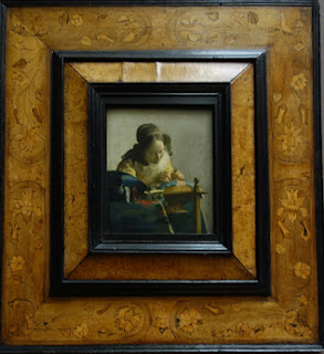
The Lacemaker, 1669, Johann Vermeer
My photo of The Astronomer did not turn out very well. The two Vermeers were on one wall together.

The Young Artist, 1673, Jan Lievens

Woman Preparing Legumes, 1684, Pieter de Hooch
(there were a number of paintings by Pieter I liked, but this one was my favorite.)

Young painter in the Atelier, 1673, Barent Fabritius
There were a number of Rembrandt's,both portraits and self-portraits. I enjoyed my sojourn in the 17th century very much. My companion wrote postcards under the Vermeer paintings while I took in the rest of Flemish artists. We then watched "Girl with the Pearl Earring" on our flight over the Atlantic to finish our trip.
As evidenced in the photo above and in the others I took, "The Lacemaker" got all the attention It was as if "the Astronomer" did not exist! Such a shame.

Sunday, October 28, 2012

Recap of Museums Visited-Venice

Just returned home from two weeks in Europe and thought I would write a bit on the pieces that struck my fancy. The big one that tops the list, "Sewing the Sail" by Joaquin Sorolla y Bastida, was by far my favorite.
 

Sorolla’s painting was extremely large, about 10ft. x 7.5ft. I loved the sense of light but also the liveliness of the people. This painting was housed in the Ca' Pesaro Museum in Venice. There were a number of paintings I enjoyed there and Italian painters I discovered and hope to learn more about. A few are shown below.

"Abandoned" by Luigi Nono, above, painted in 1903 was one of them. Tenderly painted it really had an emotional impact; and this is after being harassed every time you turn around with the wide eyed, sad mother of however many children, begging. There was a certain look they all have down pat, whether on the trains throughout Italy, the metro or the streets of Rome.
Another was "Toothed Prows" by Guido Marussig, 1918. Very simple, very Venice, but effective.

I will end with Umberto Moggioli, "The Artist's House", from 1918. One thing of note, there were a number of paintings by Moggioli, and the museum mounted them in chronological order, which made it nice for the viewer to watch the artist grow and change over the years. This was the latest of those on exhibit. 
There were other paintings worth noting, such as the "Rabbi of Vitebsk" by Marc Chagall, "Nude at the Mirror" by Pierre Bonnard, Anders Zorn, "Stream" and Fernand Khnopff "Portrait of Miss De Rothmaler." A beautiful museum in and of itself, the works are definitely worth a visit if you find yourself in Venice.

Monday, October 8, 2012

Month 2, Day Two; Dark/Light Pattern

Block in for Long Shadowed Tomatoes,  24x24, oil on board
I missed the lecture for the second day, but had started my next painting last week. I was able to get the tomatoes blocked in but wiped the shadows off a number of times so decided to put them in thinner until I could get the shapes right. You can see the outlines of where I have been. I will miss the next two weeks so you will get a break from instruction. Here are my notes on dark/light pattern.

Light shape and dark shape-one shape will be a pattern (in my project above it would be the dark shape that is creating the pattern). Each shape should have different proportions within the bigger shape. The key thing to keep in mind is the uniqueness of each shape within the whole pattern.When defining the pattern it does not necessarily have to be the dominant shape (see Andrew Wyeth's Wolf Moon below).
Wolf Moon, by Andrew Wyeth. the light is creating the pattern that takes your eye through the painting, yet the dominant shape is the dark.

One of the two shapes will be more tied into itself which will aid eye-flow (or how the eye moves through the painting). In the painting of Andrew Wyeth's, the middle value of the hillside and shadow on the house tie into the dark shape. One way to think of this is that if the main pattern were cut out of contact paper, you could lift one corner and pull the whole shape off in one piece. The shape does not have to necessarily connect in one piece physically as long as it connects visually.

Only two values will be visible (as talked about in previous post). Gradation of values is okay, but that middle value will be tied to either the dark or the light and will not read as a separate value. Right now, even though my shadow shape is lighter than the tomatoes, it will be tied to the tomatoes as one large shape when I am finished. I did talk to Kevin about this today and he said it would be okay to keep the tomato color true to life, just to then keep the shadow that same value. I had planned on going rather dark red on the tomatoes to tie into the dark purple shadow. I think keeping the values lighter will actually be more of a challenge for me.