Search This Blog

Thursday, February 23, 2017

Spanish Sheep Market Circa 1962

the Art of the Deal, Sheep Market, Spain, Circa 1962; oil on panel, 18x24

Here is my latest painting shown below as a work in progress.  I had wanted to do this in a square format but I did not have that sized surface ready when I was ready to go. The image used for this painting was from a slide that was turning orange that I had made into a digital image at Costco. My mother took the photo circa 1962 in Spain. The men at this sheep sale make me think of the Basque but according to her note it was just north of Barcelona, a place now known for its beaches. I was attracted to this image for a number of reason. I liked the composition; I liked the subject and I appreciated the group of men doing business. Each of them taking a unique stand, as it were. Something about a wet gray day and fairly flat light attracts me.

Sketching in on the canvas with colored pencil

Starting the big shape block in

Working on unifying the dark shapes

First wave of color in big shapes

Second wave of big shape value correction

Fine tuning figures and values, 18x24, oil on panel
I am struggling with a name for this painting; The Art of the Deal; Market Shares-Sheep Trading; Deals Going Down; Your thoughts?

Monday, February 20, 2017

Green on Green


You might ask, why do I keep painting over old works? Do I not have clean canvas's to start anew? Sometimes, yes I am out of a certain size of canvas or board so I scrounge for a piece that can be sacrificed for the greater good. Other times I choose to use an old painting because it is not worth saving in my opinion and I want to have the colors to come through on the new painting. A quick way to layer color, in other words.
Developing stage 1
Wishing to once more play around with bottles of varying colors of green, I started this piece over an old study I had done awhile back for a larger painting. (See bicycle with balloons below) I wanted to keep some of the color coming through.
Developing stage 2-getting some darks in
I began with a piece of greenish blue rice paper that I set down on the table. I then found 5 greenish bottles out of my collection that worked well together. To block out the background I put up the Japanese doll screen and used the back as the backdrop. It is a light greenish neutral color. Loosely sketching in the bottles I then used blocks of color to quickly block out the distracting balloons and bicycle leaving bits of color and line to show through. Really liking it at this stage and wondering how far do I want to take it?
Stage 3-more form
Proceeding rather cautiously at this stage as I cannot decide what to leave or what to cover. In person, I like the stripes going across the gold label on the right. But in the photos posted here, I am not liking them much. Overall, I do like the way the painting is right now and do not want to get too far along and ruin the energy it has. Any comments on that? Should I leave the line between the bottles on either side and the one in the middle (my sketching guideline)? Does it add to the composition or detract from it?
Green Bottles, 14x11, oil on panel
Writing out my thoughts in questions really helped me decide what I wanted to do. As you can see in the finished painting, I took out the sketching guide although there is a hint of it left. The dark lines across the bottle on the right also came out but not in the background. I should have been able to paint this in one sitting, but I took my time on it so that the likelihood of me getting carried away might be tempered.  Working on it in small bite-sized pieces.

Thursday, February 9, 2017

Castlewood Canyon Parking Lot

The Bird Box, oil on panel, 8x10

My daughter and I had planned to go hiking yesterday at Castlewood Canyon State Park near Franktown. Unfortunately as the time drew near to leave I realized that would not be in the best interest of my knee, which is giving me problems. So she and my husband hiked, and I took my paints along to enjoy being outside on a glorious winter day.

The top one came first. This was not what I had intended when I began. My original idea was to make it more abstract and flat. The textures in the grass got the better of me as the wind kept them moving the whole time I was out there. I see now some things that will be altered from this field sketch such as the dark green at the bottom. That needs to be softened down to be as one with the rest of the field.
Plains Study, oil on panel, 6x8
This second smaller study I was going again for flat color but the undulations of the sky and the fields come through. I hesitated to add the photo with my painting as I see so many accomplished plein air painters do this and their painting looks just like the scene they painted. I can't say the same for me...That field looks mighty monotone and mono color compared to what I 'saw.'


Thursday, February 2, 2017

The Hideout Teepee

I am a bit behind these days; I am sure the break is as welcome for you as it is for me!
The Hideout, 8x8 oil

Last Saturday I went out plein air painting again. Oh my. Will this become a regular thing again? Who can withstand the call of being in the beautiful outdoors doing the one thing you love even on an off day?

It was a new location for me, being almost to Castlewood Canyon off Parker Road. Called Hidden Mesa Open Space (part of the city of Castle Rock). I saw so many great scenes I would have enjoyed painting on my way back to my car! I must remember to pay more attention when out scouting for a scene to put to canvas. So much to think about. Be that as it may, I did find a a little spot to sit for spell and did this small sketch. I discovered this little lean to someone had very meticulously built at the base of these willows. I don't normally like to sit when painting plein air but it was necessary this day so I wanted to focus on something close up and not a broad landscape view. There was a picnic bench nearby and a trail where some one or a number of people must come here. It is not seen from the main trail that takes you back to Cherry Creek and the walk along the mesas. It may not look that big from this sketch but I would think two kids or one adult could sit in there comfortably. I did  not go in to see the insides.

Tuesday, January 24, 2017

The Rush is On

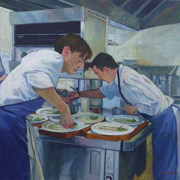
Starting with the finished piece first and then the explanation for a change. I repainted this piece over three or four days while also working on a few other paintings. It took me a bit longer than I expected as I thought I would only "fix" a few areas. I don't think I left anything untouched except the hair on both of their heads.
2017 The Rush is On, oil on canvas 24x24


2010, oil on canvas, 24x24

2016 showing repair and mounted on board (bad lighting lightened up the overall image)
This painting is 6 years old. There is nothing major wrong with it for where I was at 6 years ago. A year or two ago I had hung it in a place where I could look at it with the thought to revisit it. If a painting hasn't sold, it is always fair game. For whatever reason, it fell off the wall one night - it woke me up- and on it's way down, hit a few places and in one particular sensitive area ripped a substantial hole. I could not decide if it was worth fixing or if I should just chuck it. I researched repairing paintings. So many different approaches. Some said do not patch an area as it will shrink at different rates and then will always looked patched, so reline the whole painting. Others said patch and you will be fine! The repair kits I found were nowhere near a 24x24" size. This particular painting was cotton canvas on the 1.5" profile of stretcher bars. Not my favorite painting surface.

After much contemplation, I took it off the stretcher bars and glued it to a gator board trying very hard to line up the edges of the tear across the front waiters forearm. I filled in the area with a bit of gesso and lightly sanded the area. I could not sand it smooth as the texture of this canvas was rough. I tried refilling the area and sanding again. All I can say is that it is as good as I can get it. It was worth trying to save at this point as moving forward I was going to repaint the whole thing. The structure and drawing are pretty good so it should be pretty straight forward. The major issue with the original version from my perspective today is once again a value thing. So in the redo, I pushed the values away from the middle. Not much color shift overall except in the skin tones. I thought the waiter in the back had too blue gray a skin tone so I lightened up his face overall and to his arm in the shadow made it a reddish blue.

There is something about the original version that I still like but overall I am still happier with the redo.

Sunday, January 22, 2017

Another Go at it

Ye Olde Beer Glasses, 12x9, oil on canvas
Ok, round 2 of these beer glasses. I know I am getting behind in posting the paintings I have been working on for this month of 30 paintings in 30 days (now amended to painting every day for 30 days). I decided to work this one up again. It is not quite where it needs to be but it is far enough along to talk about. The first go around I felt the beer and the table were too close in color so in this version I lightened the table and gave more orange color to the beer to aid the contrast. The table really is sunshine yellow formica from the 60's. I believe these glasses are also from that era. They appear to be hand blown as they are both heavy glass and very irregular in shape. My drawing is really not that far off, believe it or not. I am working from a phone photo not from life. I had given this pair to my daughter for Christmas so she sent me the image to show they are enjoying the glasses. I never thought to paint them from life while they sat in my cupboards for the past 20 years!! Shame on me. And I like wheat beer, which is what these glasses are for. Weissbier in German. Prost!

Wednesday, January 18, 2017

Creek Crossing

Creek Crossing, 12x12, oil on linen panel
Here is something a bit different from all the still life setups I have been doing this month. The direction I was going here was to keep every thing very simple and in that I think I succeeded. It may still need a bit of fine tuning but I made myself stop as simple is simple and maybe it is time to just let some things be. Hard as that is for me to do.

I was up in Parmalee Gulch on a plein air paint out a number of years ago and we were painting along this creek when these kids came into view. I had forgotten all about this image but came across it recently and it was just what I was looking for and didn't know it.
Queen Anne's Lace, plein air study, Parmalee Gulch
This is what I was working on when the kids crossed the creek near me. The shadows were deep that fine summer day.